


How to Include Promotions and Offers in a Customer Portal?
What is a customer portal?
Customer portal, also known as customer account, cockpit or dashboard, is a place where customers can see their profiles, order history, available discounts, loyalty points, coupon codes, gift card balance, and more. In this post, I will focus on the display of promotions and offers in a customer portal to make this space even more engaging and personalized.
Why is including promotions in the customer portal important?
Customers may have more than one deal at once and they usually have accounts in more than one store. It is difficult for them to keep track of special offers, loyalty points or gift card balances across various websites that they may be visiting only sporadically. Customer dashboard is supposed to make it easier for them to find offers available to them, which in turn can make them more prone to completing a purchase in your store, if there is a great offer waiting for them. Otherwise, your incentives or their collected points/gift card balance may go unnoticed and unused.
How to design a customer portal for promotions display?
Here are some quick tips on how to design a great customer portal:
- Make sure the information you display is up-to-date. If you cannot display information in real-time, ensure that it is updated frequently.
- Make it reachable – add it to the customer account or to another very visible place, so that customers can easily find the dashboard.
- Display all types of deals, currencies and points in the same place. If you disperse this information, it will be difficult to find and digest for your customers.
- Display the expiry dates of all offers, balances and points.
- Display the used or expired deals, at least up to some time in the past, so that customers can keep track of what they used already or see what they missed (and be more motivated to use the future deals).
- Display upcoming deals, to encourage customers to come back to your store. This one may be tricky, as you can deter customers from placing the order right now, as they may be waiting for a better deal. It can make sense in the case of highly targeted, personalized promotions.
- Arrange the information either by type of offers or by the expiry dates or both. Do not display the deals at random, as they will be more difficult to read through.
- Display the deals using nice, related visuals to make them visually appealing.
- Keep the information the same cross-channel. Offer a customer dashboard on both, website and mobile app, if you have one.
- Make the deals accessible offline in brick and mortar stores, if you have such. This will make using them easier for the customers.
Examples of customer dashboards
We will go through a couple of real-life examples of customer dashboards to show you possible frontend applications for displaying offers and promotions.
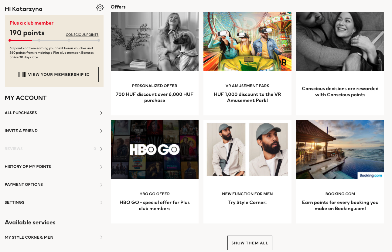
H&M
H&M offers a customer cockpit displaying the loyalty club membership level, loyalty points and how many points are missing to the next reward or to keep the loyalty account active. The dashboard also displays all available H&M and partner offers. They do not show historical offers.
Pros of their customer portal design:
- All types of promotions and offers are displayed in one place.
- They clearly state the amount of discount straight on the discount preview picture (when you click on the picture, you are taken to a subpage that displays the details of the offer).
- It displays the loyalty program membership level and the number of points on a progress bar, showing how many points are missing to the next reward or to keeping the membership status. The information is clear and easy to track.
- Sometimes they display upcoming offers (for example, the birthday coupon).
- As compared to other brands’ customer portals, theirs is visually appealing.
Cons of their customer portal design:
- The timeframe of the offers is only visible if you click on the offer, on a separate subpage.
- They do not display offer history. They do not display the history of points.
- Some thumbnails are black and white, I do not understand why some are black and white and some are colourful.
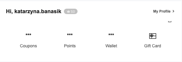
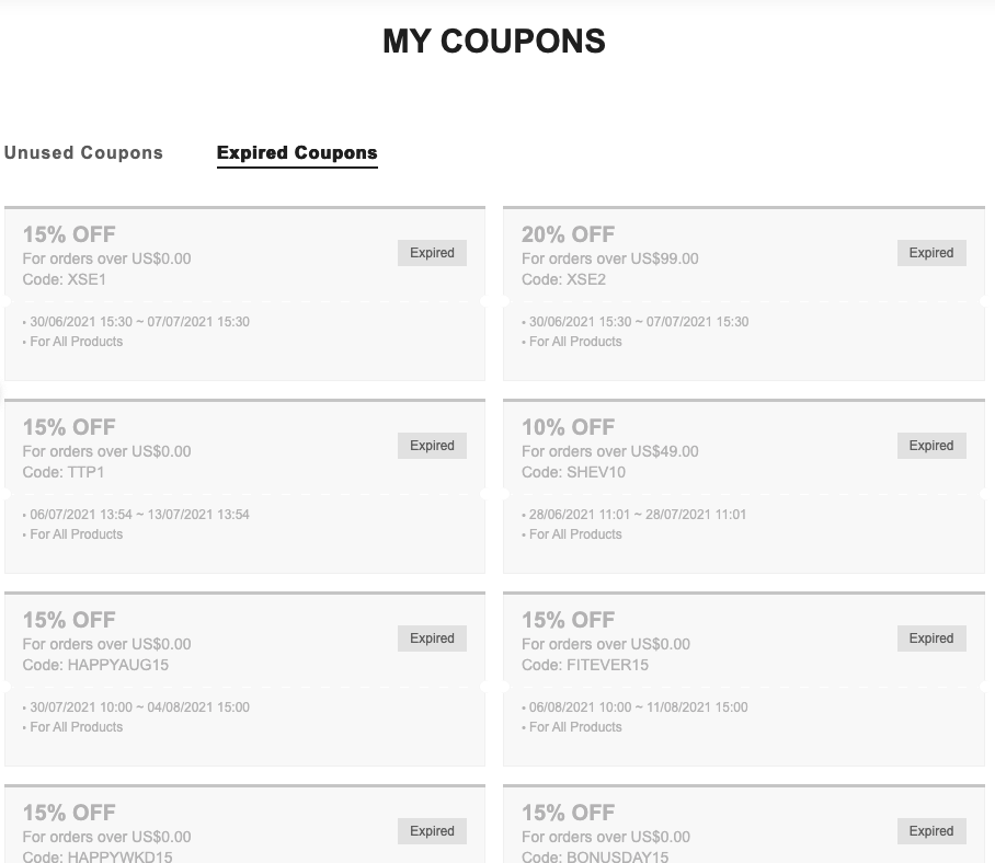
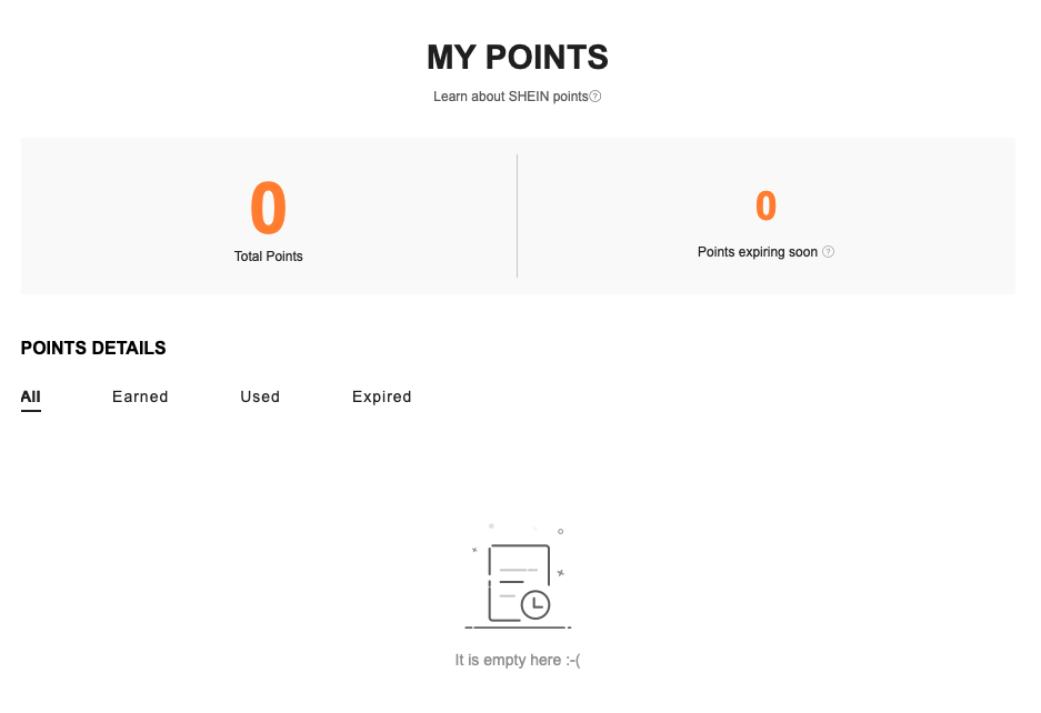
SHEIN
Shein displays the customer dashboard in the customer account as four tabs leading to subpages that give more information about coupons, loyalty points, wallet and gift cards. They display all active, expired and used coupons and points. It would have been easier for customers to navigate through it if all the information was on one subpage though. This way it requires a lot of clicking through to see what is the status of all offers and deals. However, the small preview in the customer account gives a quick overview of the most important numbers.
Pros of their customer portal design:
- Their design is simple but functional, easily readable.
- They display historical (expired) coupons and points.
- They display all information in one place (coupons, points, currencies, gift cards).
- There is a lookup tool for gift cards, if the gift card is not automatically registered in the customer’s profile (for example, if someone got one from a friend it would not be automatically in their profile but they can look up the available balance).
- Preview of all points, currencies, gift cards and coupons available.
Cons of their customer portal design:
- The different incentives are on different subpages, to check all incentives a customer has to go a lot back-and-forth between the main screen and the subpages. It would have been easier and possible to have them all on one screen (subpage).
- The design is not visually appealing (black and white, quite raw). The coupons do not have any visuals.


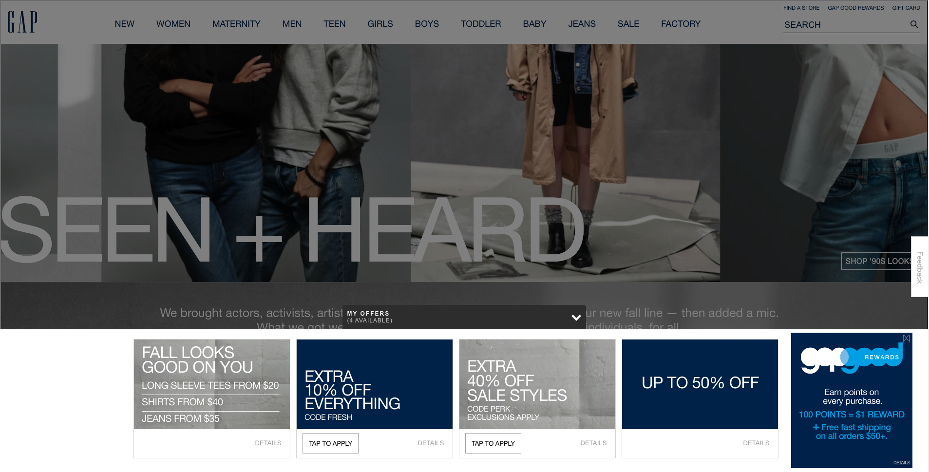
GAP
Gap displays available offers on the main page, through an extendable bottom ribbon. It does not require logging in (and therefore displays non-personalized promotions) but it gives a full overview of available promotions and offers. Upon logging in, they also display loyalty points credit.
Pros of their customer portal design:
- It is reachable from the main screen.
- It is branded.
- It shows the earning history (earned points).
Cons of their customer portal design:
- The information is spread out and not reachable in one place (deals and offers are on the main page ribbon, the loyalty points upon logging in the account).
- There are no personalized deals and offers displayed as the ribbon on the main page shows the same information to all, logged and not logged-in customers. There is no space for personalized promotions if the company runs them or decides to run them in the future.
- The main page ribbon can be annoying if someone does not want to check that information (it can be collapsed but still covers up part of the screen).
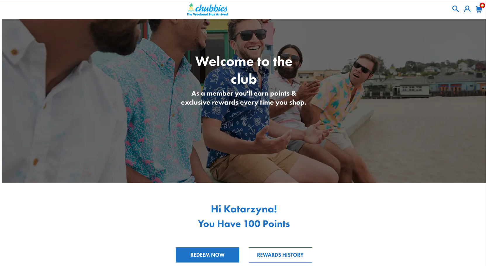
Chubbies Shorts
Chubbies Shorts offer a customer portal that shows the loyalty points status and ways to earn points. They display all promotions and offers straight in the basket, also for not logged-in customers.
Pros of their customer portal design:
- The loyalty points information as well as earning rules and rules of the loyalty program are all explained in one place.
- All offers and promotions are in the basket view and can be added to the basket there, no need to copy and paste coupon codes or to check any other page for promotions.
Cons of their customer portal design:
- Loyalty information can be found in both, basket view and on a customer portal page while the deals and offers are only in the basket view. They could be both on the same page and additionally in the basket view.
- No space for personalized deals and offers. The deals and offers in the basket are available to all customers.
- The deals and offers in the basket view do not contain detailed information about the promotion. They should lead to someplace with terms and conditions of the offers or there should be a separate page for all deals and offers where this information can be found.
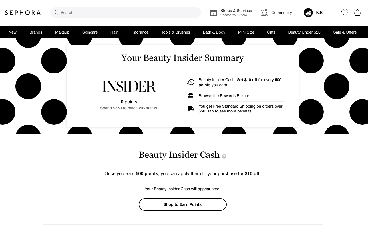
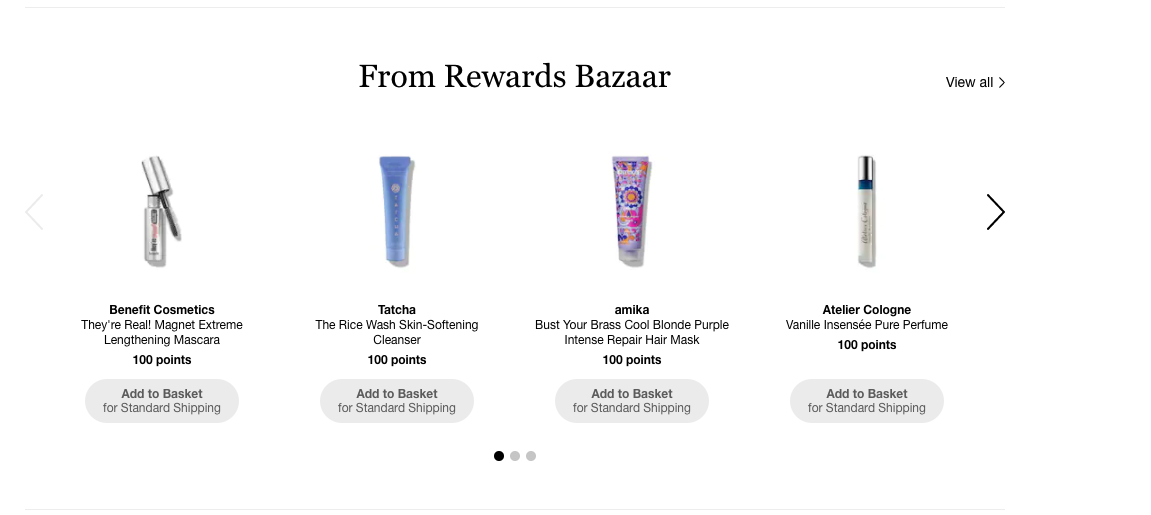
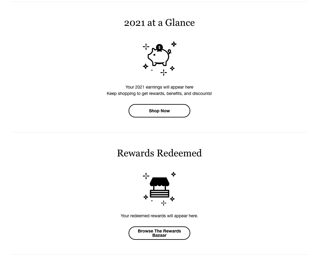
Sephora
Sephora displays the loyalty points and cash status in the customer account. They also display the savings up to date in the current calendar year, redeemed rewards, redeemable rewards and points activity (accumulated, redeemed and expired points).
Pros of their customer portal design:
- The loyalty points, history, possible rewards and earning rules are all on one page, making it easy to orientate in the loyalty program of Sephora.
- Branded, clearly readable design.
- Historical information is available.
Cons of their customer portal design:
- Promotions and offers are not easy to find, there is no place for them in the customer portal view. Customers have to check their emails, Sephora’s website and other channels to find the deals.

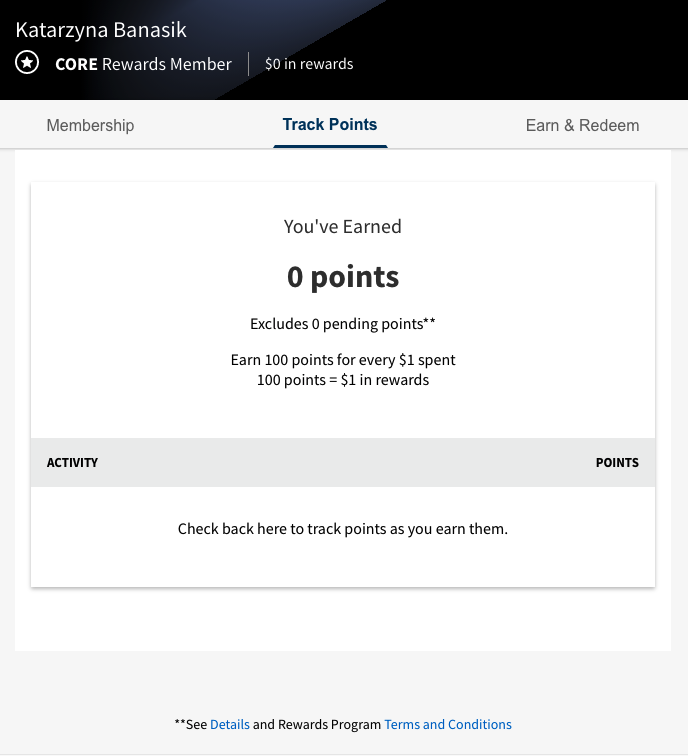
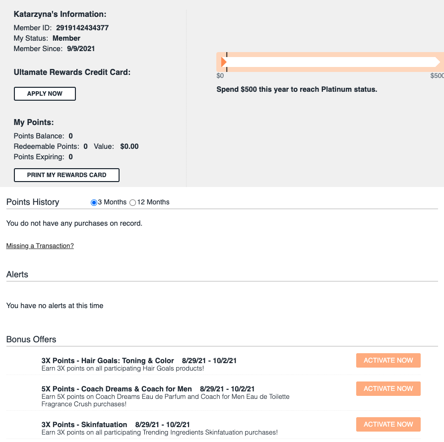
Ulta Beauty
Ulta offers a very simple (visually) customer portal displaying the loyalty program status (number of points, membership status), points history, how many points are missing to reach the VIP membership level and any special deals and offers for the loyalty program members (that can be activated from that dashboard). While the design is very minimalistic, it is quite readable and clear for the users, meeting the basic requirements.
Pros of their customer portal design:
- They show a progress bar showing how much is missing until the next loyalty program level.
- They show points history.
- The bonus offers are displayed as well in the same customer portal.
Cons of their customer portal design:
- It contains only the loyalty program information, it does not mention promotions and offers.
- Special deals have to be activated, they are not activated automatically.
- The design is very minimalistic and not on-brand.
Summary
Customer portals should contain information about available promotions, coupons, gift cards and loyalty points to make it easier for customers to find and navigate through your offers. The best practice is to make this section easily accessible, simple to navigate and visually appealing. It should also be up-to-date and available both on website and mobile app.
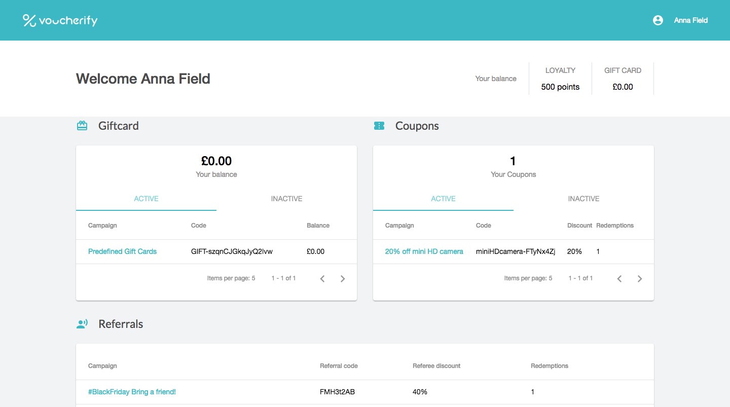
With Voucherify Promotion Engine, you can create customer cockpits using our out-of-the-box frontend design or create the frontend yourself and use our flexible API to display the promotional data to the customer. The API enables you to use your own frontend and display the customer dashboard on any current or future channel, using GET API calls.
{{CTA}}
Start building outstanding customer portals
{{ENDCTA}}


.jpeg)
.jpeg)