


Gift Cards UX and UI Best Practices
It’s not surprising that gift cards have become a hot topic in ecommerce. They are not only great for expressing gratitude and affection but also are an effective solution to some hair-rising purchasing dilemmas when you are running out of time to come up with a clever idea for a gift.
Table of contents
- Design a separate path-to-purchase for gift cards
- Create a separate landing page listing all gifting options
- Provide a separate section for customers to check gift card status
- Promote gift cards in multiple spaces
- Design the gift card purchase journey
- Choosing gift type
- Selecting the card format
- Choosing delivery date (optional)
- Choosing gift card amount
- Providing recipients’ information
- Personalizing gift card code
- Selecting gift voucher templates
- Uploading a photo to customize the cards
- Checkout process
- Send cards to recipients via multiple channels
- Come up with an effective email design
- Redeeming gift cards
- Allow partial redemptions
- Design the gift card input field
- Create success and error messages
- Design gift card expiration notifications
- Summary
Almost $3 billion in gift card cash went unused in 2019 alone. Meanwhile, total gift card spending in 2019 clocked in at $98.6 billion. Source
Knowing that gift cards are an extremely potent tool, it is worthwhile to simplify the gift cards’ path-to-purchase and redemption process. But how should the input fields be designed? On which subpages should they be promoted? And how should the card purchasing and redemption look based on UX principles?
This blog post collects best practices and inspirations for designing gift cards UX and UI for website and mobile. We will cover the whole customer journey from promoting gift cards on your site to completing the purchase process, sharing the card with the lucky recipient, and finally, redeeming the card at your store.
{{EBOOK}}
{{ENDEBOOK}}
Note: All desktop screenshots were made on Mac, Chrome.
Note: This post's primary focus are purchasable gift cards as either digital codes or printed cards. If you would like to learn more about using gift cards as promotion tools and incentives, I highly recommend checking out our UX guide to coupons and promotions.
[Webinar] eCommerce Hacks for Promotions UX
Your promotions and loyalty programs stopped moving the needle? Have you checked their UX lately? Join experts from Divante and Voucherify who discuss the ins-and-outs of designing effective promotions and loyalty programs. From common UX fails to the best practices to avoid them. But, that's not all – explore how to test promo UX to ensure that your promotions are driving engagement and increasing loyalty. Watch now.
Design a separate path-to-purchase for gift cards
Path-to-purchase for gift cards can widely differ from the standard customer journey, especially if you offer digital gift vouchers. This is why it should be designed as a separate module of your site. Most gift card paths-to-purchase will come down to several crucial steps that need to be reflected in your UI design:
- First, finding the gift cards section in your store.
- Choosing the gift card format and template (recommended).
- Selecting the card value.
- Setting the delivery method and date.
- Filling in the recipient’s information and the message that will be sent with the card.
- Checkout.
As you can note, this process varies from standard product purchase where a product is added to the cart, and no extra details need to be provided. This is why you need to develop a different design for this section that differs from your standard product view page. But more on that later.
This post is written mainly for e-gift cards. If you only offer gift vouchers at the brick-and-mortar locations, here’s a list of UX best practices for physical cards:
- Make them eye-catching – the design may decide if a customer will notice them and consider a purchase.
- Wrap them up – put the cards in envelopes and provide a space for customers to write a personalized message or best wishes.
- Put them on display – put them everywhere and make them impossible to overlook (e.g., cashier’s desk).
- Make them mobile-friendly – ensure mobile redemptions and allow customers to redeem gift cards displayed on a mobile device. For example, by using QR codes or barcodes that can be scanned and saved on a mobile device.
However, if you went digital, here are some of the top guidelines to ensure that your gift card journey is appropriately designed from the UX and UI perspectives.
Learn more: 13 examples of gift card campaign done like a pro
Create a separate landing page listing all gifting options
Now that you know about the necessity of investing a bit more time into designing your gifting module, it becomes clear that you will also need a landing page. Your gift card landing page should clearly explain the available gift card options. It should showcase different card designs (if you offer many) and present different card delivery options (if you provide both email and print). It is also recommended to place some FAQ or T&C there to offer additional information to potential buyers.
Example:
Zalando has a dedicated landing page for promoting their gift cards. From this view, potential buyers can see all possible personalization options and choose between standard cards and gift boxes.

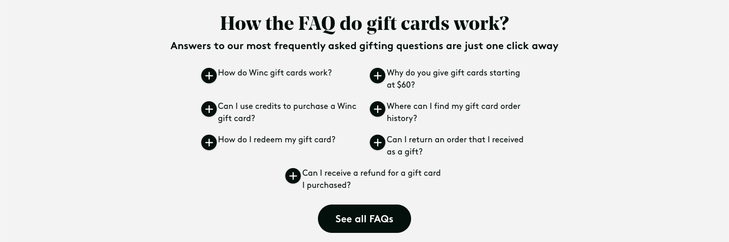
Winc, a wine e-commerce business, included a FAQ section on their gift card landing page with a clever copy.
You can use the landing page not only to showcase your offer but also to allow customers to check their current card balance. Some companies also use this space to let users reload the cards they already own.
Provide a separate section for customers to check gift card status
It doesn’t matter if you offer gift cards as an incentive or a purchasable product, it is still recommended to provide a separate space for users to verify their card status. You can allow customers to check card validity, current balance or even recharge the card or transfer credits to another card.
Example:
Shein has a small widget in their gift cards section that allows customers to check their gift card balance making this space the go-to place for anything gift cards related.

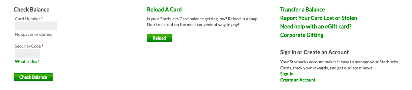
Starbucks lets users check balance, transfer balance, report any issues, or reload cards in a separate section of the page.
Promote gift cards in multiple spaces
Besides creating a landing page for your gift cards, you should make this part of your store easily accessible for any potential customers. You won’t see much revenue flowing from gifting if customers cannot easily find cards on your site. Information about gift cards should be placed in the page navigation bar and the footer. If gift cards are something new or a gifting season is about to start you can consider launching a special promo campaign with a discount on the gift cards to increase customer awareness.
Example:
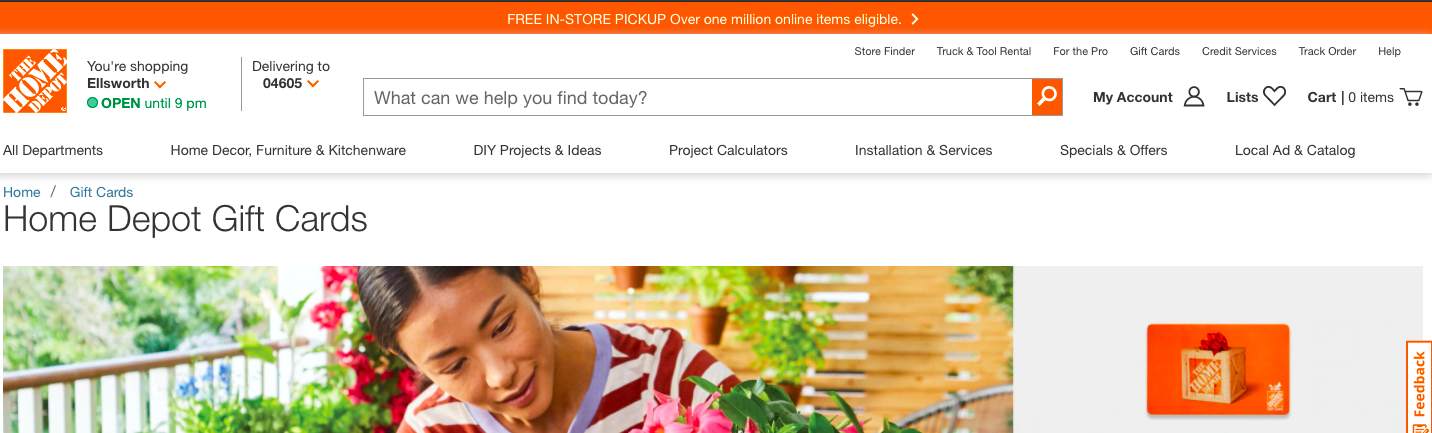
The Home Depot, besides a navigation bar, also has a top bar with additional services. They decided to use this space for promoting gift vouchers. It follows good UX practices as customers will at all times see this offering at the top of the page.
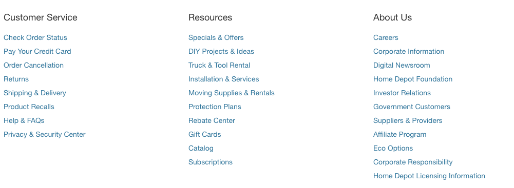
They have also included gift cards at the footer.
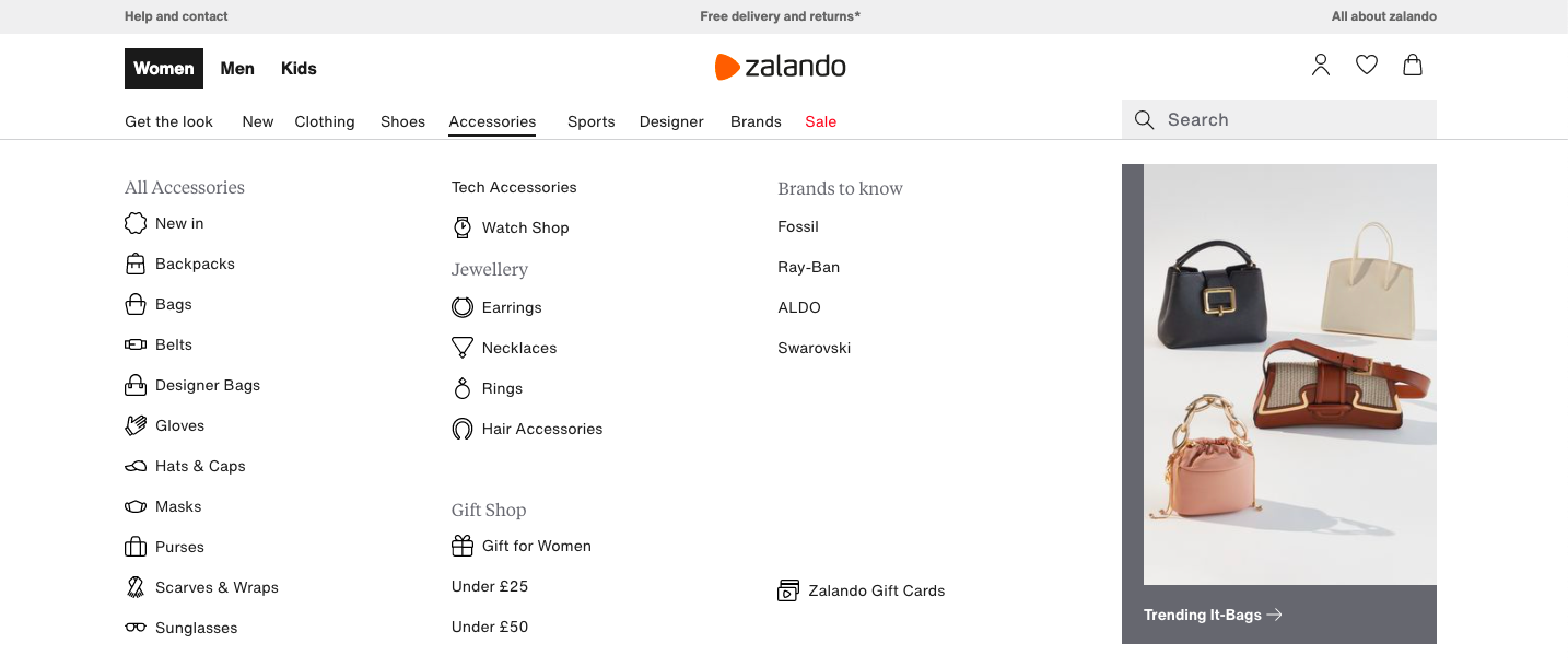
Zalando informs about gift cards both in the navigation bar and the footer. However, in this case, gift cards were listed under the Accessories category, making them harder to find than in The Home Depot.
Besides website or mobile app navigation, you can also add gift cards to the footer of your emails. In addition, you can also incorporate them into specific stages of the customer journey. For example, you can mention gift cards in the post-purchase thank you mail to encourage shoppers to get someone a gift card to your shop since they already enjoyed shopping with your brand. Another idea would be to add cards to the recommended items section near the cart view.
Speaking of emails, you may also consider sending separate messages to promote gift cards at certain times of the year. For instance, target holidays such as Christmas or Mother’s Day with dedicated email messages about gifting possibilities in your store.
Example:
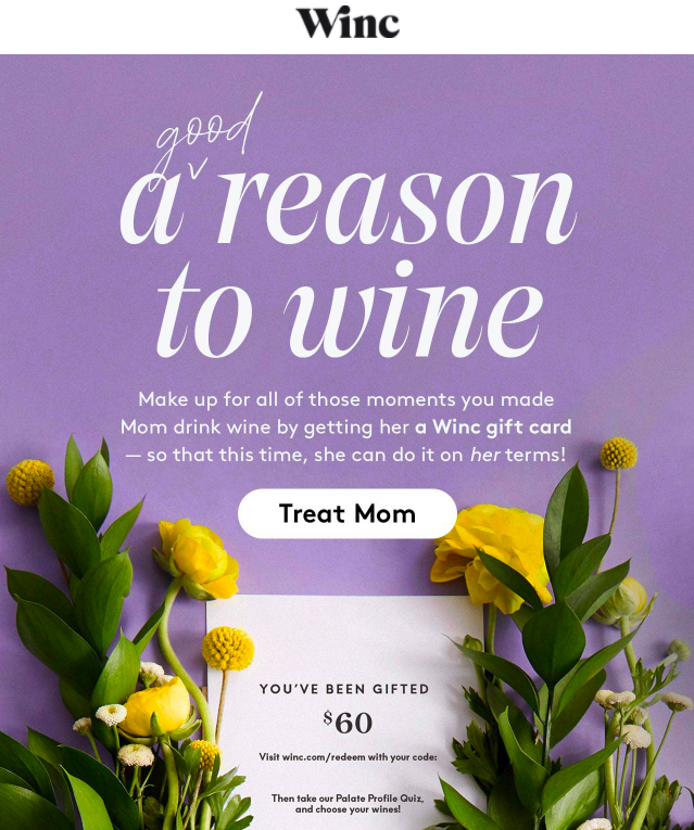
Winc sent a separate email to remind subscribers about Mother’s Day and promote gift cards.
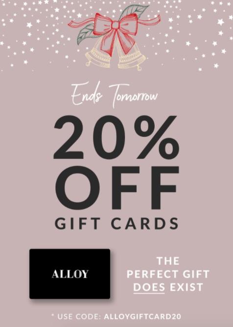
Alloy Apparel launched a discount campaign on all physical gift cards when the day before Christmas to give customers a chance the purchase the cards last-minute.
Design the gift card purchase journey
Choosing gift type
Now that we know how to make sure that customers find our offer, we can design the best possible path-to-purchase. Of course, your path-to-purchase may differ from the one I’m going to cover below.
Example:
PrettyLittleThing offers only one gift type and format. This is why their customer journey begins with the selection of gift voucher templates.

Let’s start with selecting the gift card type. There are plenty of available gifting options, ranging from individual digital vouchers to corporate cards and group gifting. The design for this phase will hugely vary depending on the range of gift cards you want to offer. Make sure that no matter how many options there are, they are all listed legibly – it is highly recommended to keep your information architecture flat unless you want to emphasize only one gifting option.
Example:
The Home Depot offers multiple gifting options. The individual cards are promoted at the top banner above the grid of equally important bonus options, making the layout understandable for the user and all options visible at a glance.

Zalando also offers more customization options but opted for a vertical layout where customers need to scroll down to see all available options. As Zalando offers only individual cards, they do not need a flat layout. Instead, they use the page to switch focus to different templates and options. The extra option (gift boxes) is offered at the bottom of the page, making it clear that it is not the main product.

Selecting the card format
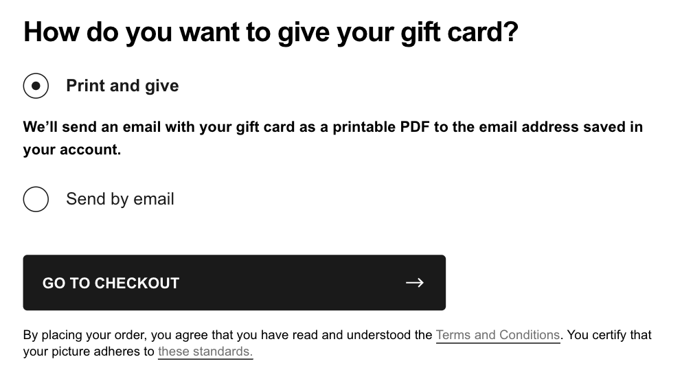
If you offer both digital and physical gift vouchers, the next step in the path-to-purchase should be the choice between these two options. Note that this and the following steps should be all presented on a single page. Directing users to new pages to complete the purchase process will likely damage the experience and cause them to drop out.
The selection between delivery methods should be clear. You can try using contrasting colors or icons to underline the difference between both options. It is also recommended to use clear copy – the contrast between “Send by email” and “Send by post” should be transparent enough. You can also offer an option to have printable design (a PDF attached to the email) besides the completely digital format if the gifted person receives it by email but wants to bring it to the store printed. You can also incorporate a gift QR code in the email so that it can be quickly scanned at the POS.
Example:
Victoria’s Secret begins its customer journey with the choice between delivery methods. The UI places the same importance on both options. However, I would recommend more contrasting CTAs – “Send by mail” and “Send by email” can be confusing, especially for non-native English speakers.

Choosing delivery date (optional)
To boost the UX of your gift vouchers, you can add a bit more personalization to your digital cards by allowing users to choose when precisely the card should be sent. It makes sense from the usability perspective as cards are usually sent as gifts – it sucks to send a birthday gift five days before the big date, right?
Example:
PrettyLittleThing makes it necessary for the user to set the desired delivery date and hour. They used a simple dropdown list. I would recommend using a calendar date picker instead, which gives users a better view of the date they have selected (e.g., day of the week).
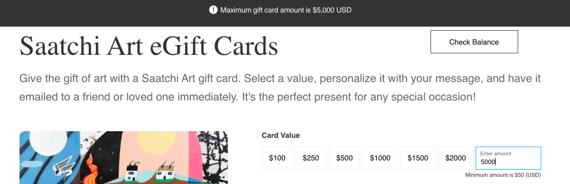
Choosing gift card amount
In the next step, you should allow users to select the gift card amount. The combination of suggested and clickable values and custom input fields works best. This way, you give users a clue as to what the gift value should be and make it easy to select, and at the same time offer a field for customization if the customers want to purchase a non-standard card value.
Example:
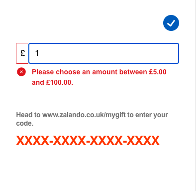
Saatchi Art, an online art marketplace, uses both suggested values and a custom input field not to impose any limits. If the user exceeds the maximum gift card value, they will receive an error message informing them about the error details at the top of the page.

Zalando imposes limits on the gift card value placing the possible values between 50 and 100 GBP. This approach can make sense from an economic standpoint. However, it dramatically limits the flexibility of your vouchers and may lead users off your site if they wanted to get a more expensive gift card.
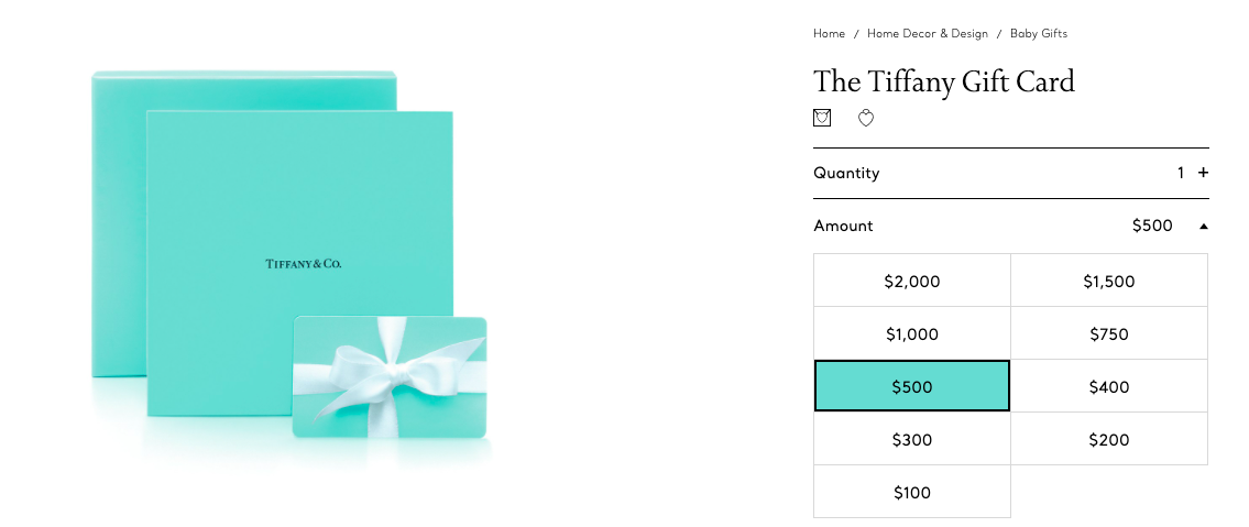
Tiffany & Co. does not offer custom card values. Instead, they provide predefined card values. What is worth noting is that the default card value is $500 even though lower values are available. This way, Tiffany & Co. manages to direct customers to focus on cards of higher value and make them more desirable and perceived as the standard price.
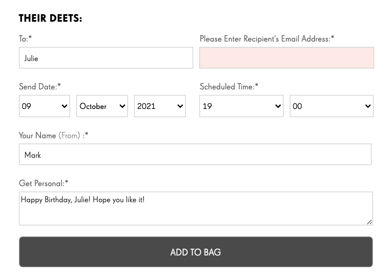
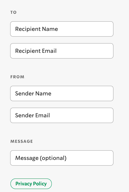
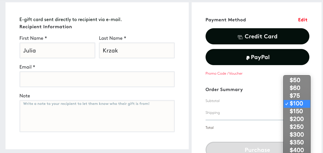
Providing recipients’ information
This is a crucial step of the design process, especially in the context of digital vouchers. You should cover at least two input fields here – the recipient’s email address and the gift card message that the email should carry. Some companies also offer subject line customization options to make the card delivery even more personalized. The key thing is to require only necessary information (recipient’s name and email address). Do not include too many extra fields.
Another thing is the card message – it’s best to provide a prewritten message to make it easier for customers to send the cards faster. You should, however, let users change or customize the messages if they don’t like the prewritten text. Also, make the message field optional.
Example:
Starbucks offers a simple UI for recipient’s and sender’s information.
Amazon gives users a simple prewritten message to provide them with an idea of what the message could look like.

Personalizing gift card code
If gift cards are a big part of your business, you may think of further enhancing their personalization potential. Your gift card software should allow you to customize the gift card code to match the recipient’s first name or include the special occasion the card is connected to (e.g., HAPPYBIRTHDAY7593). This simple trick will make the card more memorable. The unique pattern will also make it easier to apply the card code at the checkout due to the exclusion of confusing characters or proper length. Go here for more details on improving the code validation experience.
Selecting gift voucher templates
As gift cards are usually sent as gifts, it’s best to make them visually pleasing and related to the occasion. For example, imagine getting a birthday card that’s all grey and with no birthday wishes. That wouldn’t be the best gift, would it? This is why it’s recommended to offer at least several gift voucher templates.
Example:
Amazon offers plenty of card templates, and users can shop by occasion, simplifying the card path-to-purchase. Their gift card engine provides gifts for lots of occasions. Moreover, with multiple, diversified designs, it makes a prepaid card look like a tailor-made gift.

Uploading a photo to customize the cards
A bonus UX quick win would be to allow users to upload their photos to personalize the card. Note, however, that adding this feature requires you to come up with terms of use for photographs to protect yourself from violating any 3rd party intellectual property rights.
Example:
Zalando allows users to create their card designs. However, to make sure that everything is settled on the legal side, Zalando requires users to comply with their terms of use.
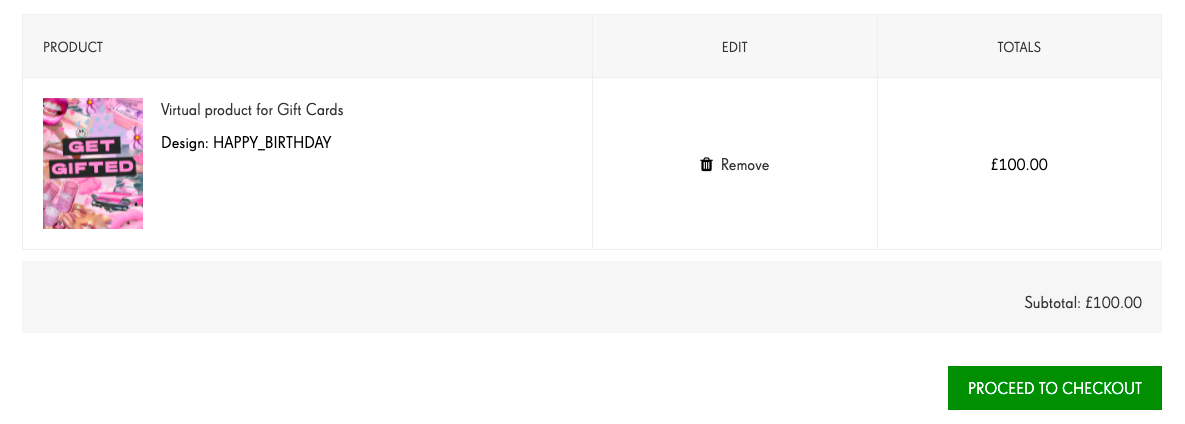
Checkout process
When users fill in all necessary information, move on to the checkout step, designed as your standard checkout. Make sure that users can quickly correct the information they provided or make changes to the card without deleting the whole basket and starting from scratch every time they make a change. It is also recommended to fit card details in this view. You could use an expandable text hidden by default and presented when users click on a designated icon or hover over the card.
Example:
PrettyLittleThing is an example of a bad gift card checkout UX. After users add the card to the basket, there is no simple way to update the card details, such as the recipient’s info or voucher value. The only way is to remove the card from the cart and begin the whole process again.
Winc allows users to update the card value while still in the basket view.
Send cards to recipients via multiple channels
There are multiple options to share cards with the recipients. Here are some of them:
- Send via email message.
- Send to the buyer as a printable PDF that can be shared physically with the recipient.
- Deliver physical cards by post to the buyer or recipient.
- Send via social media, e.g., Messenger, Whatsapp.
As far UI design goes, we will focus on the digital cards sent by email message to the recipient. If it’s the first time recipients hear about your brand, you may implement several trust signals onto your email. Here are some tips on how no to end up in spam:
- A clear sender identity is an important trust marker – you may consider including the sender’s name in the subject line of the email with the gift card attached to boost trust. For example, use the subject line “Katie just sent you a present!”
- Leverage personalization – if you have the recipient’s name, you should add it to your email to improve UX and make the message more trustworthy.
- Don’t overhype the gift card value in the subject line – try to refrain from using phrases such as “voucher”, “code”, ”deal” or numerical card value in the subject line. The recipient’s email provider may treat your message as spam or place it in the Promotion tab of the mailbox.
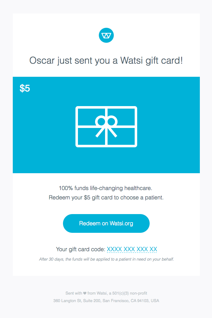
Come up with an effective email design
When it comes to the email content, it needs to cover several points:
- Include the value of the card.
- Include a link to specific T&C or additional information on limitations of card redemption (if there are any).
- Gift card code that is easy to copy to a clipboard, preferably with one click.
- A CTA that takes the recipient to your store.
Remember that users can read your mail on both desktop and mobile devices. To ensure that your gift cards are mobile friendly you can include deep links in the CTA to ensure that the users go straight to your ecommerce app with the gift code already added to their digital wallet. If you decide on email format only, then make sure to include an easily zoomable barcode or QR code with a high contrast rate to ensure that the scanning device at the POS can redeem it.
Example:
Watsi, a charity healthcare organization, marks all the checkboxes when it comes to proper gift card email design.
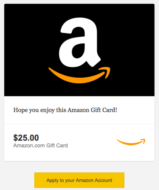
Amazon treats gift cards as store credit that can be kept on the account. In their email message, they included a deep link that takes users straight to the Amazon website or app (depending on the device) that automatically applied the credits to the receiver’s account.
Redeeming gift cards
As suggested by Kim Salazar, the usefulness of coupons and gift vouchers is directly proportional to their ease of use in the online store.
You should avoid imposing any limits on gift voucher redemption, such as the minimum order amount. Another general good UX practice is to remember that gift card recipients will be more sensitive to delivery and product cost information. Such a customer configures the cart content with greater attention than usual. This is due to the fear that the difference in the nominal card value and the order amount may be lost. This is why you should also take a look at the user journey as a whole and introduce fixes to deliver the best possible user experience.
{{CUSTOMER}}
{{ENDCUSTOMER}}
Allow partial redemptions
You can treat gift cards as a payment method, not a promo voucher. This option is great if you use rechargeable gift cards, as in the Starbucks case. Then the balance on the card is dynamically calculated, and the credits are used as a payment method. Similar to a credit or debit card. If you opt for this solution, you need to make sure that the gift cards have no expiry date on them (or a very long one). This can make your gift cards very attractive, but at the same time, it demands a high-quality infrastructure to keep the card redeemable forever.
Example:
Shopping with a Zalando gift card is easy, but getting started can pose a challenge for the user. To use the gift card as intended, the receiver needs to set up an account and find “Your vouchers tab,” and place the gift card code in the designated text field to redeem it. After redemption, the cash loaded on the card is treated as Zalando credits and can be used as a purchase method.

The problem with this approach is that the users may not know that they need to set up an account to redeem the card and see their balance. The card redemption is also possible in the checkout by placing the gift card code in the voucher field. The voucher amount is then applied to the total amount in the shopping basket. I would recommend making both possibilities crystal clear to the card recipient.
Design the gift card input field
Gift card recipients want to use their gifts as soon as possible. To deliver on this need, you should provide a voucher input field early in the purchasing process, preferably in the cart before checkout. This approach enables customers to check if the card is valid early on before entering personal information.
An even better approach is to offer the possibility of redeeming a gift voucher at the earliest possible stage of the purchasing process, much earlier than during the finalization and payment of the order.
Example:
Winc offers a straightforward UI design and lets users redeem a gift voucher at the very start of their journey, effectively limiting any stress or inconvenience connected with the inability to find the redemption field.

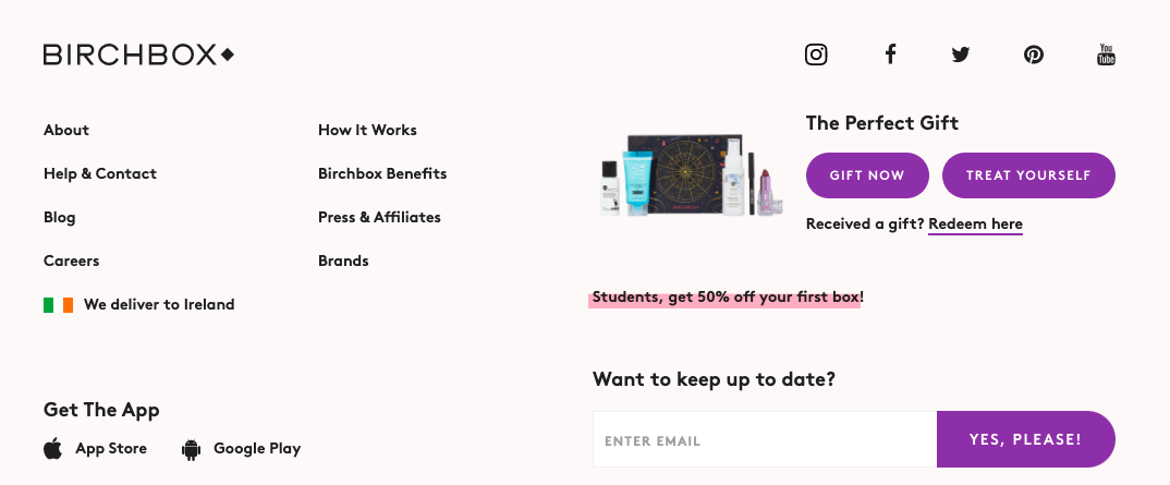
Birchbox, a subscription beauty product brand, also allows users to redeem the gift voucher right away. The information about speedy card redemption is placed in the page footer.
Moreover, the voucher input placement should be the core part of the checkout process and be properly displayed in the website or app structure. Make sure to make it long enough to contain the entire voucher code.
Another good practice related to gift codes is to clearly distinguish between payment and voucher fields as their proximity and similarity can be a source of frustration to potential buyers.
The guidelines match the best practices for coupon UI. If you would like to learn how to design voucher input fields, give it a read.
Example:
Birchbox is an excellent example of a voucher input box. The name of the box, “Promos & Gift Codes,” makes the purpose of the box crystal clear. Many e-commerce sites use “Promo Codes” as the name for this section, which can confuse gift card owners as cards are not considered promotions. They also offer a link to open a coupon code box in the checkout view for those who missed it in the shopping cart view. It is a great way to keep the option to add a coupon code on both steps.

Create success and error messages
Show a success message and the changed order total to confirm that the gift voucher code was successfully applied. Place the message close to the voucher field to make sure users see it and associate it with the entered code. Having that message show top of the page or bottom of the page may be confusing. However, the success message should not be the only confirmation the user gets. Reflect the changed order total in both the shopping cart and checkout view.
By the same logic, you should also display a relevant error message stating the type of the issue with the gift card. Do not display the same error message in every case as it will not instruct the user what is wrong and how they can fix the issue. Here are some examples:
- "The gift card code is incorrect. Please try again."
- "The gift card code is expired."
- "You are not the gift card holder (if you assign gift vouchers to individual customers)."
- "Your order does not meet gift card conditions (if you assign limits to card redemptions)."
Example:
SummerSalt displays an error message if the code entered is invalid or if the promotion conditions are not met. They encourage customers to double-check their code.

Design gift card expiration notifications
If your cards have an expiration date you need to plan ahead a bit more and set up automatic notifications to prompt users to use their card balance before it expires. Here, you should follow the best UX practices connected to email marketing, that is make the visual eye-catching, keep the copy clever, add a nicely-contrasting CTA, and refrain from using words that can be marked as spam (“discount”,”deal”,”sale”).
Summary
I hope this list of best practices will help you start designing your website and mobile for gift cards or improving your current UI design. If you're looking for general advice on building a gift card campaign, make sure to check out this guide.
{{CTA}}
Ready to bring your gift cards to the next level?
{{ENDCTA}}

.jpeg)

