


Referral Programs UX and UI Best Practices
This blog post collects best practices and inspirations for designing referral program UX and UI for website and mobile. We will cover the whole customer journey from the promotional banners, referral landing pages, sharing the referral codes, receiving referral rewards and redeeming them. We wrote this blog post based on the best performing (in terms of revenue) DTC e-commerce platforms’ UI (that you will see mentioned throughout the post).
We hope this guide will help you redesign your platform to include a referral program or to improve your existing UI. If you want to learn how to design your referral program rules, we recommend this blog post.
Note: Throughout this article we call the person, who refers a friend a “referrer” or “advocate” and the person, whom they refer, a “referee” or a “referred friend.”
Note: All desktop screenshots were made on Mac, Chrome and all mobile screenshots were made using the iPhone X resolution on Chrome.
Referral Programs UI Kit
Achieve faster time to market with ready referral components from our Referral Programs UI Kit available on Figma. Learn more.

[Webinar] eCommerce Hacks for Promotions UX
Your promotions and loyalty programs stopped moving the needle? Have you checked their UX lately? Join experts from Divante and Voucherify who discuss the ins-and-outs of designing effective promotions and loyalty programs. From common UX fails to the best practices to avoid them. But, that's not all – explore how to test promo UX to ensure that your promotions are driving engagement and increasing loyalty. Watch now.
How to ensure the best UX in a customer referral program?
Here is a quick checklist of UX tips that you can follow while building your referral solution. For more detailed instructions with examples, read on.
- Create a separate referral landing page.
- Add a catchy headline & copy.
- Explain the program rules and benefits.
- Add save-worth and branded images.
- Add a form to let customers easily participate in the referral program.
- Allow for referral code customization based on the referrer's name.
- Provide multiple sharing options.
- Provide a referral message template but allow for customization.
- Design a sharing success & error messages.
- Make your CTA clear.
- Include FAQ and T&Cs on your referral landing page.
- Add customer testimonials.
- Advertise your referral program through all available channels and touchpoints.
- Send a message to potential referrers directly.
- Create a landing page for the referred friends.
- Design progress notifications for the referrers and let the referrers track the referrals’ progress.
- Make referral rewards easy to find and get.
1. Create a referral landing page
Your referral landing page should be the main hub for your referral program information. It should explain everything customers should know about it and convert potential advocates. You should use it as the main referral hub linked in your menu or advertising banners. You should also link to it in your messages. The landing page should include a form that lets advocates grab and share referral links. Here are some tips to make the best out of a referral landing page:
Add a compelling headline and visuals
The headline on your landing page should be simple and explain what the program rules are. Here are some examples of catchy headlines you can use:
- “Refer a friend and earn never-before-seen rewards”
- “Share the love”
- “Get a free X for you and your friends”
- “Spread the word and grab a discount”
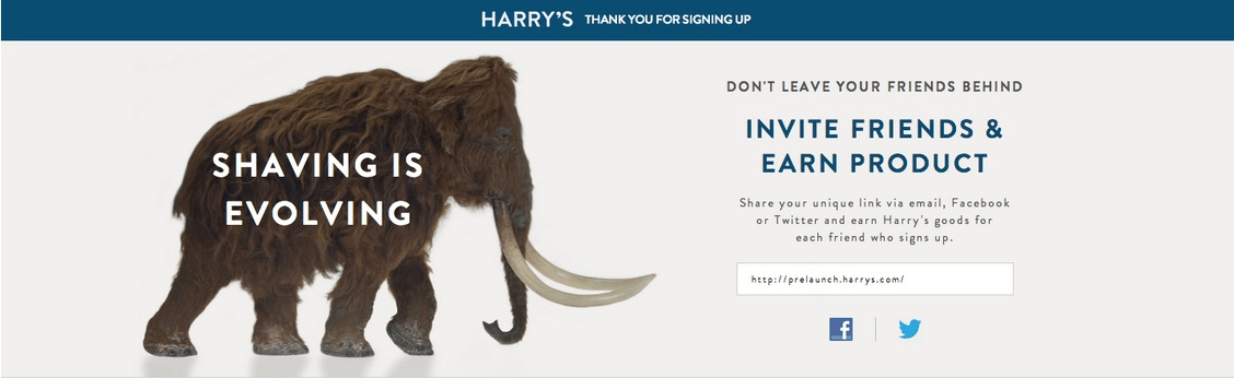
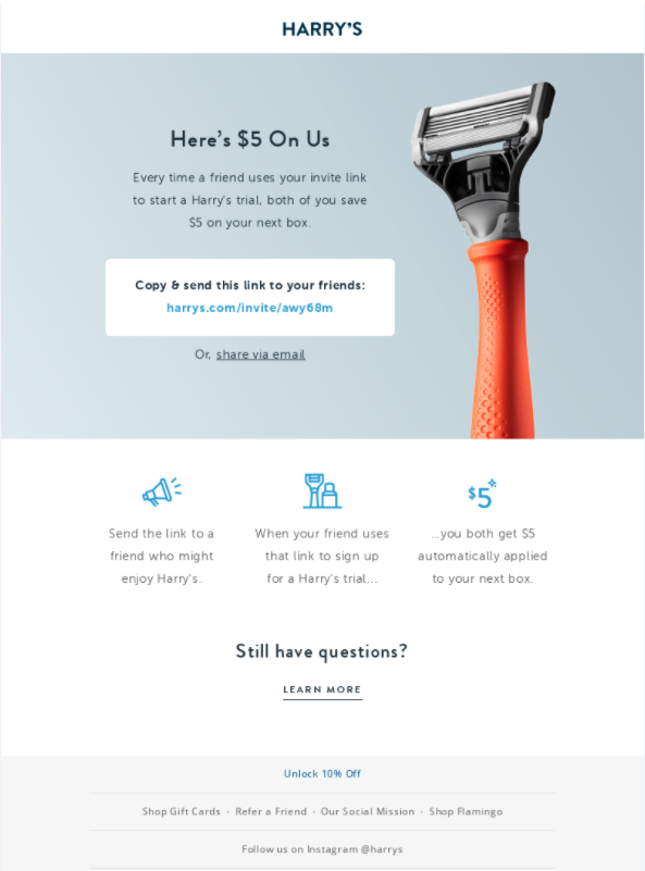
Example: Harry’s referral program page headline is short and catchy and contains the benefit: “Don’t leave your friends behind. Invite friends & earn product.”
Explain the program benefits and rules
As your customers will most likely participate in the program to get the perks you offer, start right off with explaining the benefits of participating in the program for both referrers and the referred friends. You should explain the types of rewards both parties can get, and the rewards value, especially as the referees are not familiar with your brand and may not know the value of the rewards, particularly if you offer your products as rewards.
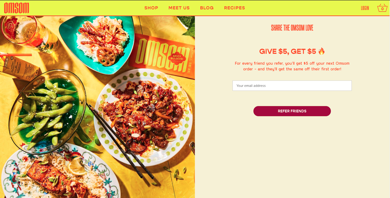
Example: Omsom has a very simple referral program page which explains the benefits for both referrer and referee clearly.
Another part is making the program rules easy to understand and follow. What advocates and invited friends should do to earn the incentive? If you have any exclusions or more details, place them on the page, but below the general rules, so that the basics of the program are still easy to grasp.
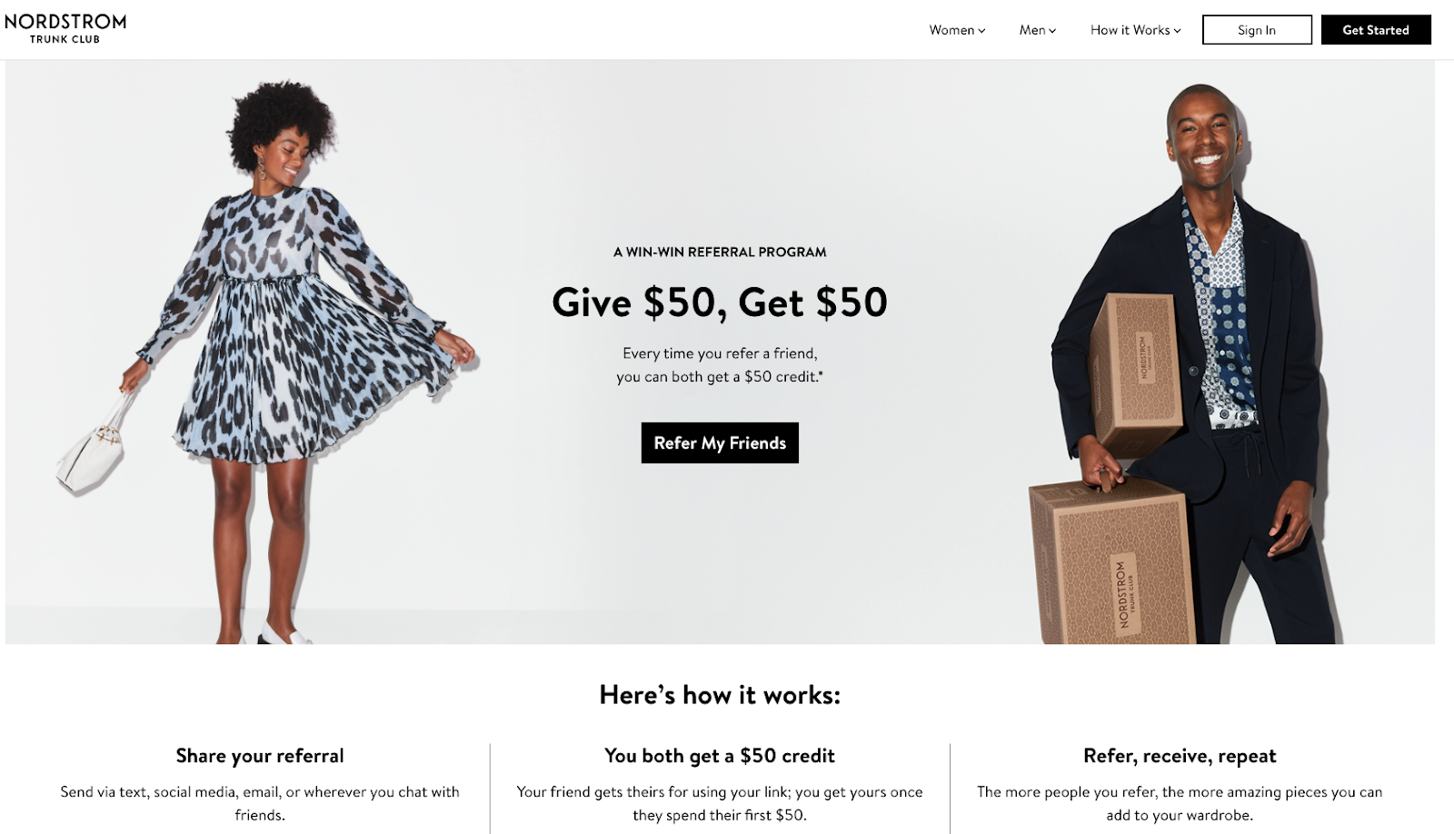
Example: Trunk Club explains the rules of the program shortly but clearly on their landing page.
Include FAQ or T&C on your referral landing page
Customers will usually have a few questions before signing up for your referral program. Add a section for some FAQs (you can select a few key ones, if you prefer to create a separate terms and conditions page) to provide ready answers for your potential advocates.
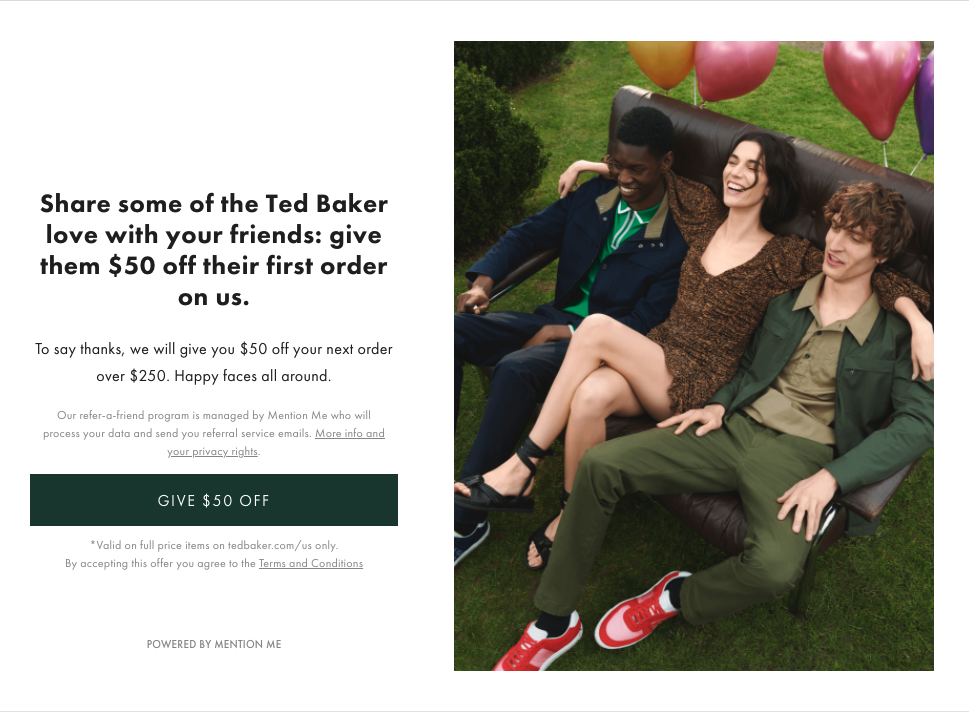
Example: Ted Baker has a link to their Terms and Conditions on their referral landing page.
Add testimonials
Testimonials are a great addition to any landing page. Although not often seen on referral landing pages. If you can show customers some social proof, they’ll be more inclined to join your program or purchase from you for the first time. This is especially important if you send the referral landing page to the referred friends, who do not know the brand.
2. Add a referral sharing form
If you want to get as many referrals as possible, you should make it easy to join and participate in your program. Require potential referrers only to fill out basic information, like their name and email address. Do not include too many extra questions or options you don’t really need to run your program. This will help you convert interested customers into advocates better.
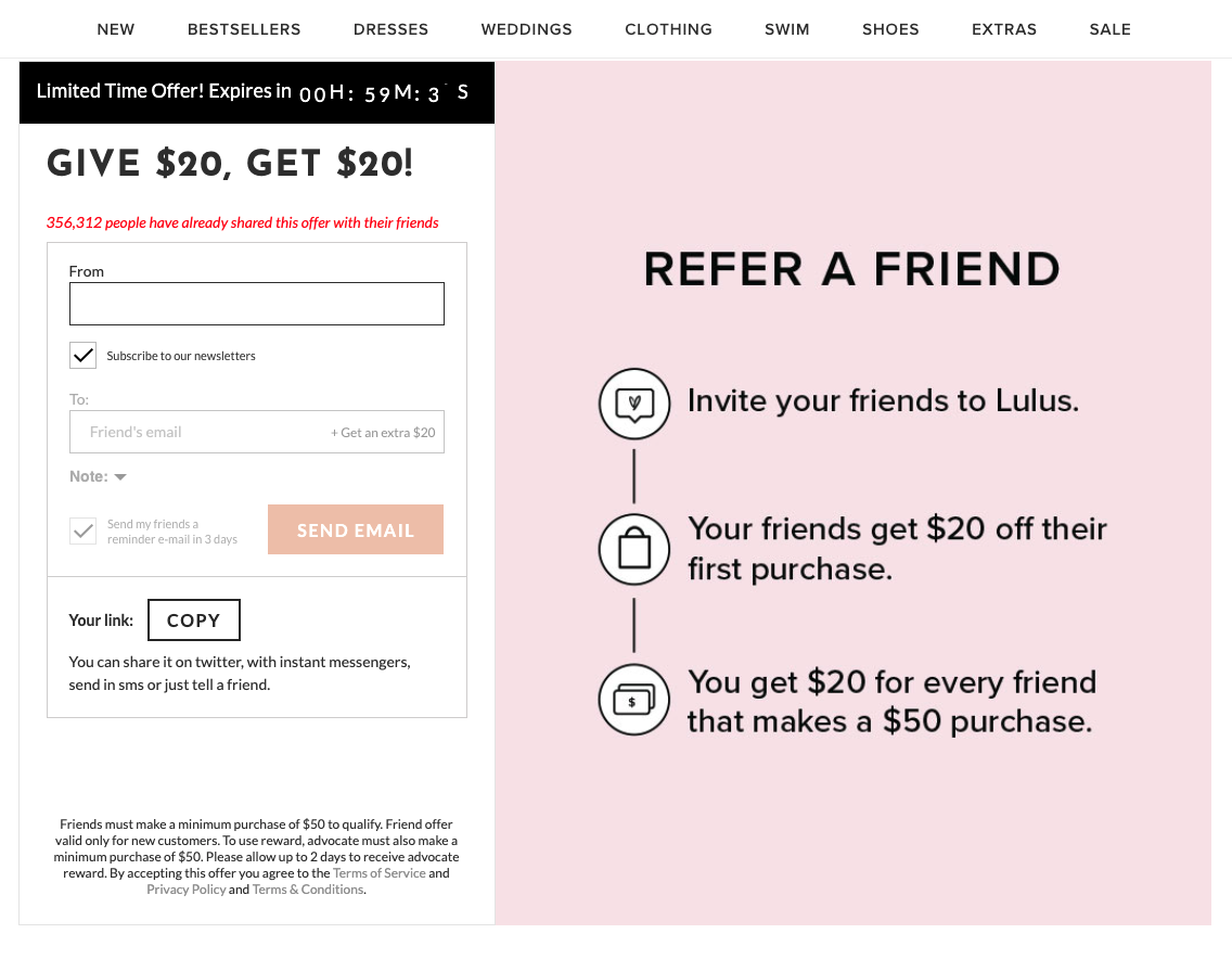
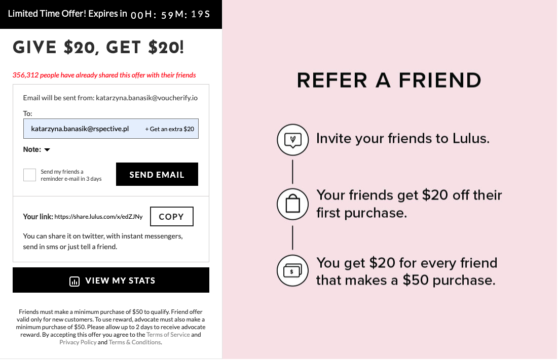
Example: Lulus offers a simple form, next to which the referral program rules are explained shortly again, for a reminder.
Allow for referral code customization
If you use referral codes or referral links, allow for code or link personalization (for example, KATE-10 or www.domain.com/kate-10). It will make it more shareable, easier to remember and more likely that your referrers will add it to their social media post, for example. Having these kinds of codes or links helps your friends identify with minimum cognitive effort that this is an invite from a friend..
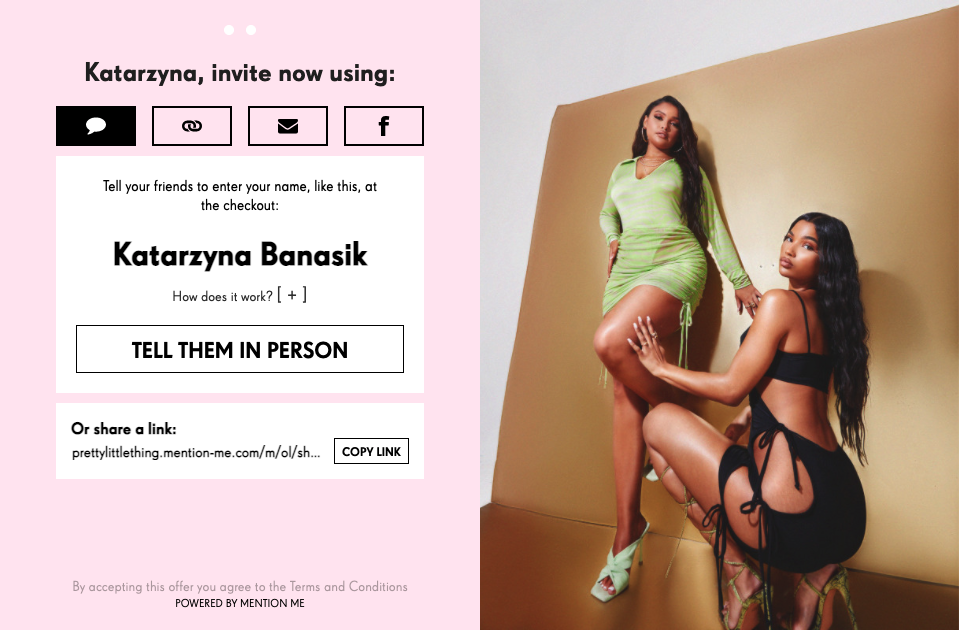
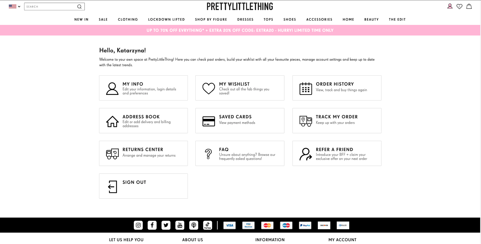
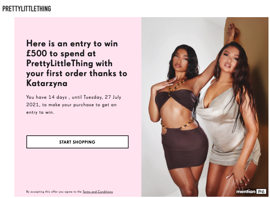
Example: Pretty Little Thing creates customized referral codes from the name and surname of the referrer.
Provide multiple sharing options
Provide plenty of sharing options based on your audience demographics and preferences. If they prefer using social media over emails, provide options to share the referral link or code via social media natively. If you have your referral program on the app, use the built-in sharing function for the mobile apps to use all the options the mobile usually provides. This way your referrers will have access to their phone address book, email lists, and social media accounts right off the bat. It will also help with the user experience as they know how this functionality works.
Remember to provide relevant links for mobile and desktop. If you send a link to a mobile device, it should open your app or app store, if on desktop, it should guide the users to the desktop site. You can do it, for example, using Branch. See how Shopmark used Branch to create relevant referral links omni-channel.
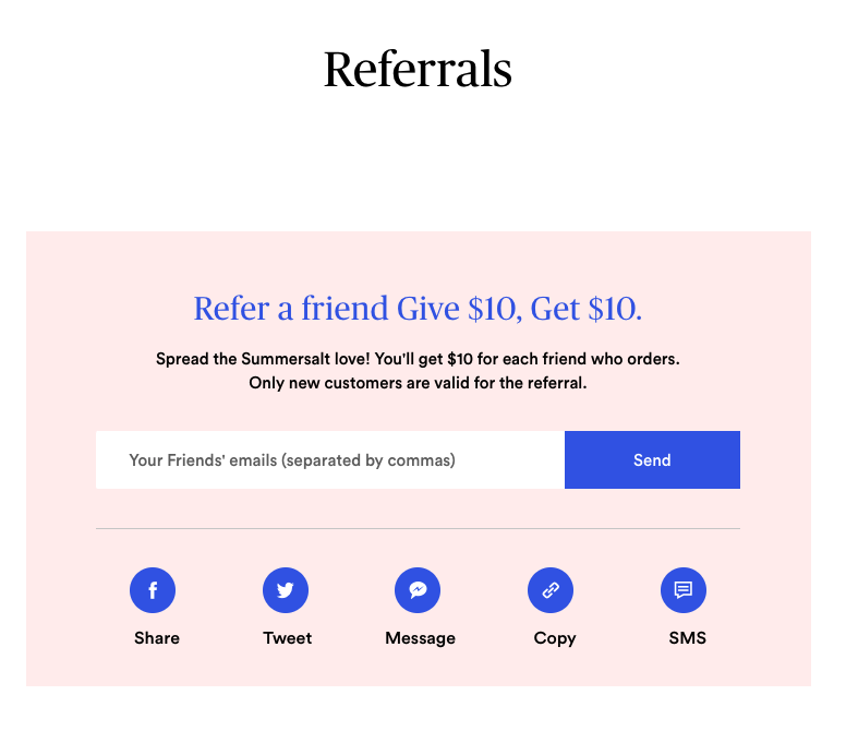
Example: Summersalt provides multiple options to share referral links – via email, SMS, Facebook, Messenger, Twitter, or simply by copying and pasting the link.
Prepare a ready referral message template but allow for customization
In some cases, it’s best to provide a prewritten message to encourage potential advocates to send invites to their friends. This will make it easier for the referrers to send the referral messages. You should, however, let the referrers change or customize the messages if they don’t like the prewritten copy.
When it comes to the copy of the referral message, you should make it a bit more informal and personal so that it sounds as if the referrer wrote it themselves. You should include the name of the referrer and the referred friend to personalize it a bit. It should be short, straight to the point, explaining a little bit about the brand and their product as well as explaining what’s in it for them (a discount) and how to get it (use the referral code). You should also include a visible CTA so that the referred friend does not have to think much about where to click to check the offer.
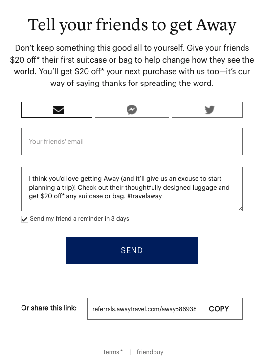
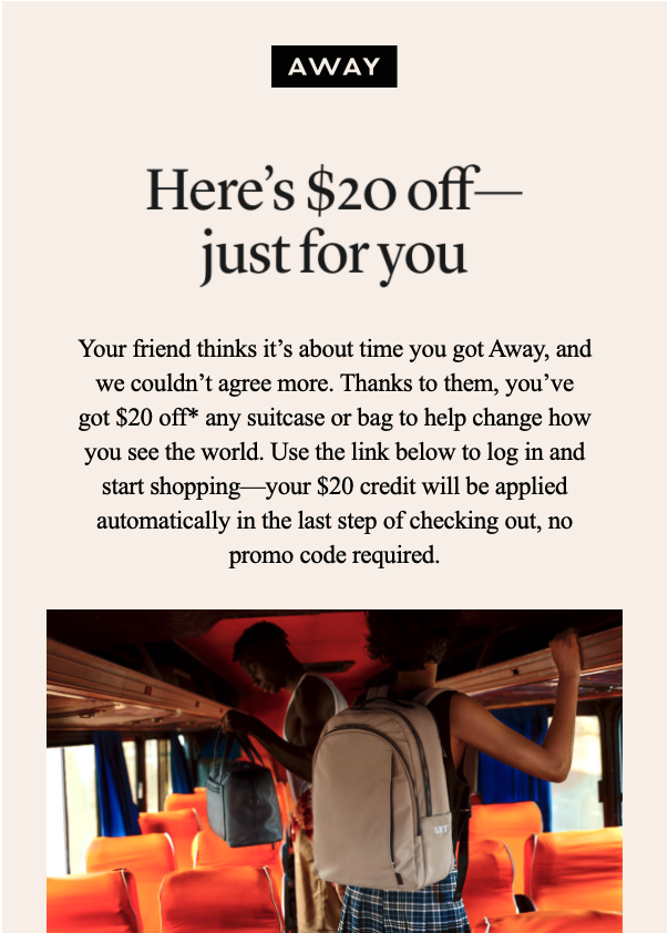
Example: Away has a short referral form that requires only the referred friend’s email address and has a prewritten message (that can be customized). The message is short and informal and explains the product value, context and the reward they can get thanks to the referral link they received.
This is how the referral email looks like once sent to the referred friend:
Design a sharing success and error messages
Display a success message if the referral code was successfully sent or copied to clipboard.
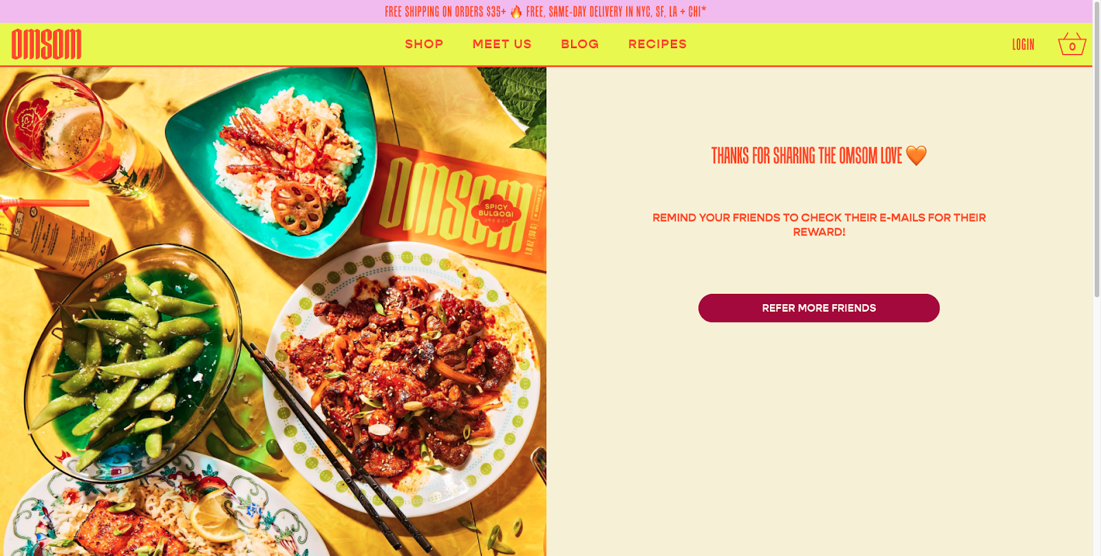
Example: Omsom shows a success message if a referral was sent successfully. They also encourage the referrer to refer more friends there.
On the other hand, you should also display an error message if things go wrong. For example, if the friend was already referred by the referrer or is already a customer and does not meet the program conditions.
Make the CTA clear
Your form will require some kind of CTA that will send the referral message to the referred friend(s). Everything in your referral program landing page should lead to the call to action. A referral call to action should catch the eye and invite people to click. Make the text bold, underlined, or a different color. Some designs add even more emphasis by adding arrows that point to the CTA.
When it comes to the CTA copy, the fewer words used, the better. Some ideas for the CTA text include: “Join our program,” “Start sharing now,” “Earn your first reward,” “Sign up,” “Join now,” or “Start sharing.”
Example: Lulus has a simple CTA “send email” as the primary way of sharing the referral link is via email.
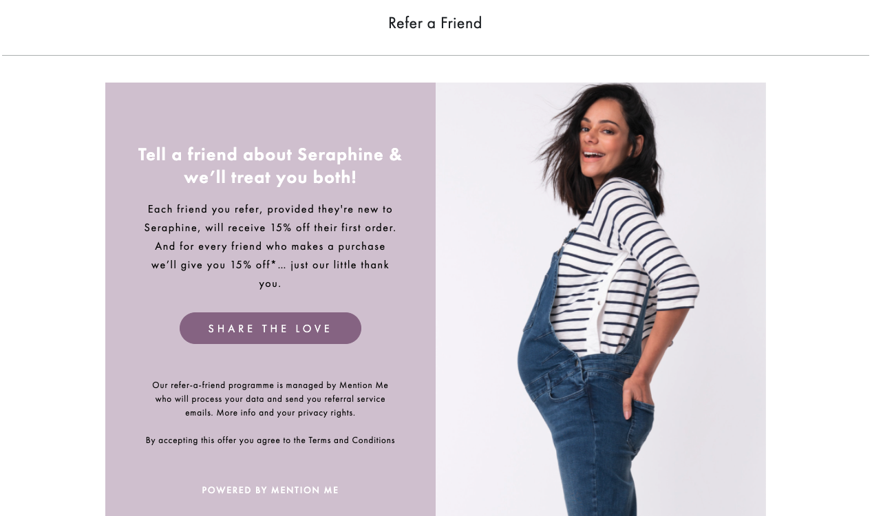
Seraphine has a cute CTA “Share the love” on their referral program page.
3. Promote your referral program
A referral program is worthless if your customers are unaware of it. You can, for example, add a widget (similar to chat widget) on all the pages that prompts users to refer the brand to their friends. Here are some other options for great referral UX:
Advertise the program on your website or mobile app
Think of adding banners to your home page, a link in your menu, information about it to the customer account (cockpit), or writing a blog post or a press release to get the word out. It should not just be promoted on one landing page that nobody knows about. It should be part of your core offering, visible straight from the home page on the website and mobile app throughout all pages up to the post-checkout pages and thank-you post-purchase emails.
Example: Pretty Little Thing has a link to their referral program in the customer account.
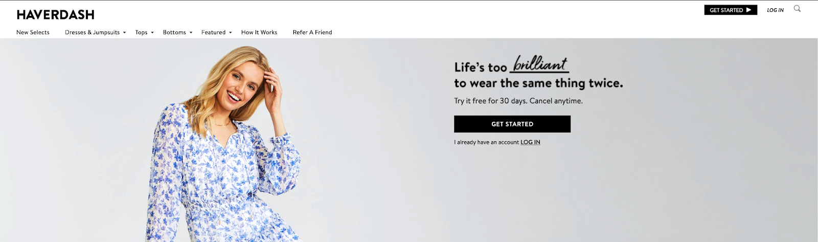
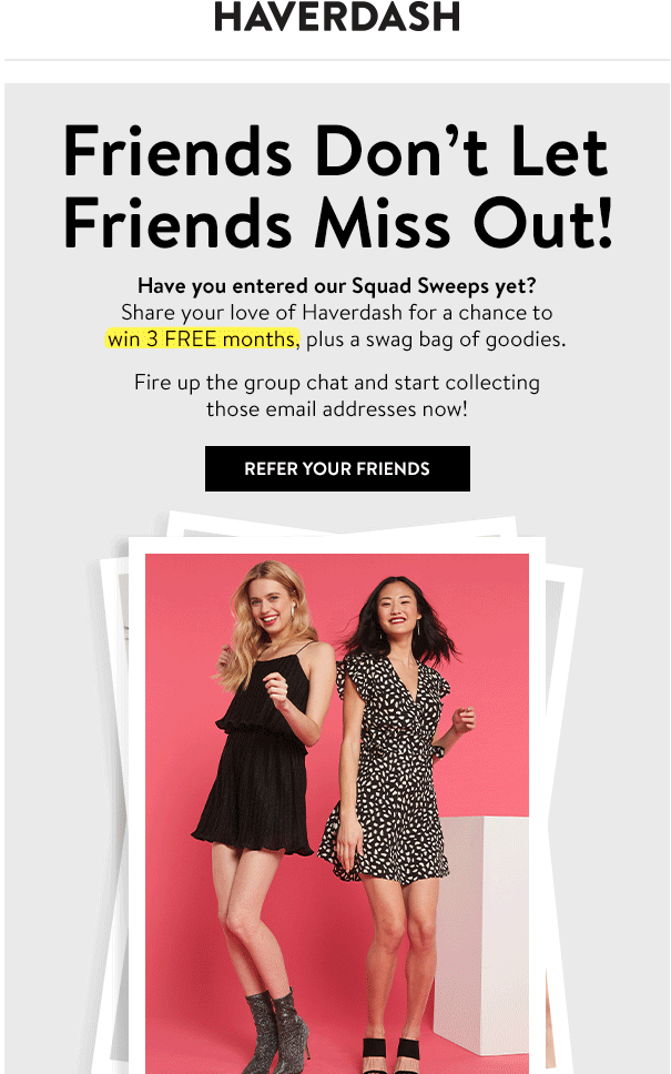
Haverdash has a refer a friend link in their main menu on the website.
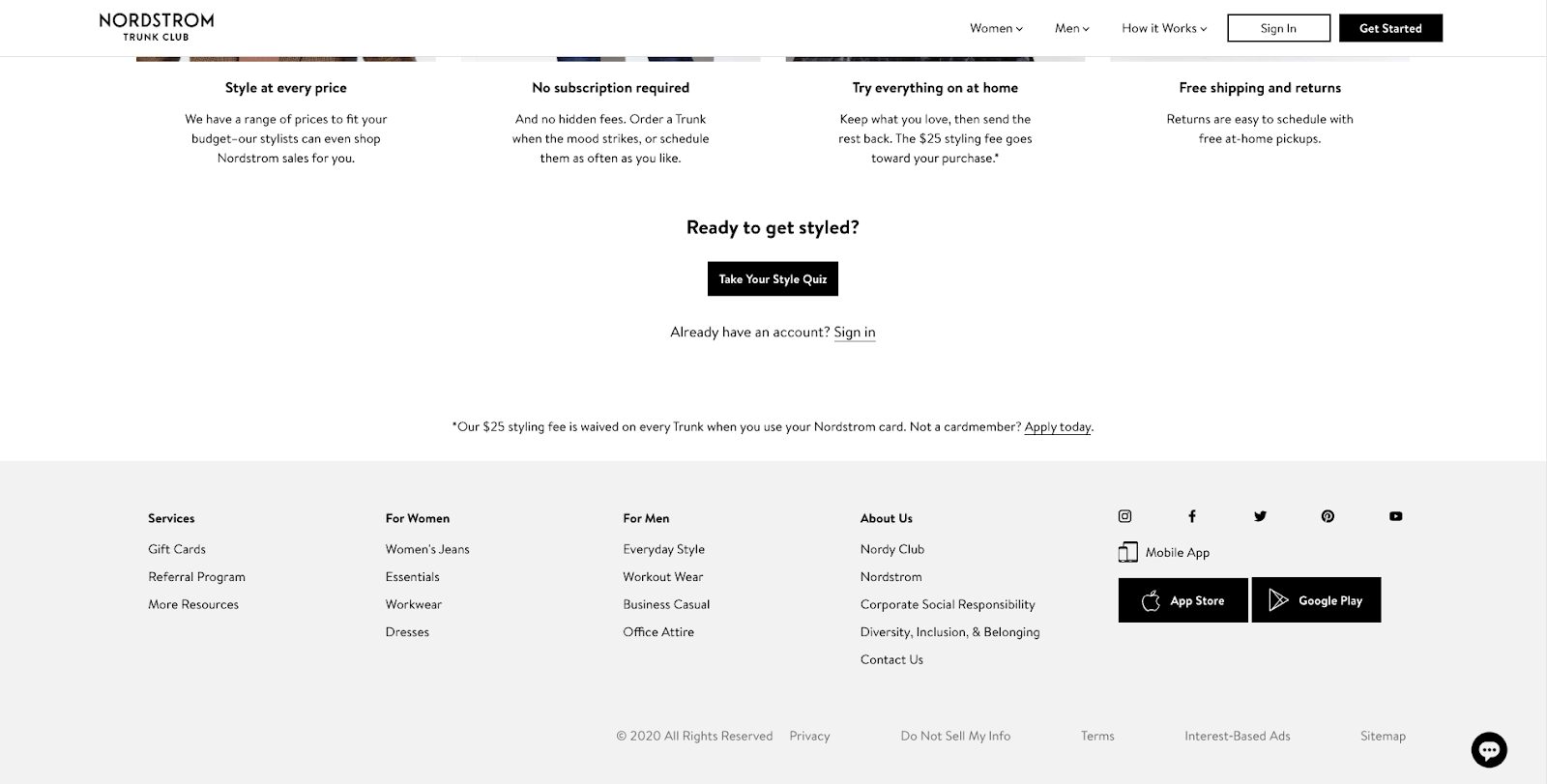
Trunk Club has their referral program landing page in the footer of their website.
Advertise your referral program on social media
Think of advertising your referral program on social media, especially if you have a big followers’ base there. It will cost you almost nothing and can bring more participants in.
Advertise your referral program via emails
You can add your referral program to the footer of all your emails or as a banner for all the emails. You can add it to certain emails as well. For example, re-engagement emails, purchase confirmation, post-purchase thank you emails, or newsletter.
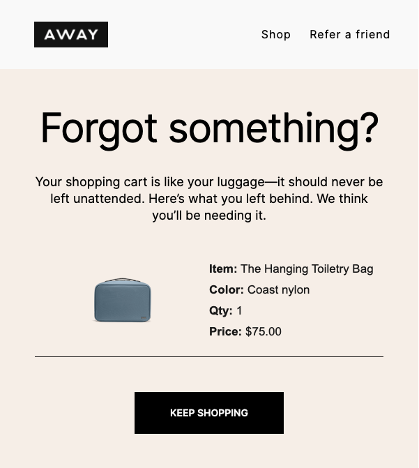
Example: Away adds “Refer a friend” link to abandoned cart email.
Send a message to potential referrers
Another way of advertising your referral program is sending a message directly to potential referrers. You can inform them about your referral program and encourage them to take part in it. You can do it initially, when you launch the program, as well as send reminders if they have not taken part in it yet.
As for the message design, you should start with a concise headline that explains what the message is about. Including benefits straight in the headline will increase the open rates and prevent some spam reports.
Then, you should explain why you are contacting them (to inform them about the program, to remind them about the program), what the program is about (exact benefits, rewards), how it works (what are the main program rules) and lead them to a short CTA, for example “Learn more” that directs them to your referral program landing page. You can also add a referral code or link directly in the message so that the referrer can copy it and send it over to their friends without having to go to your landing page. This will shorten the number of steps they need to take to invite friends. Do not forget to link your landing page or terms and conditions page somewhere in the message still, because your customers need to have access to the exact conditions of the offer.
Example: Harry’s sent an email advertising their referral program that clearly states the benefit for the referrer.
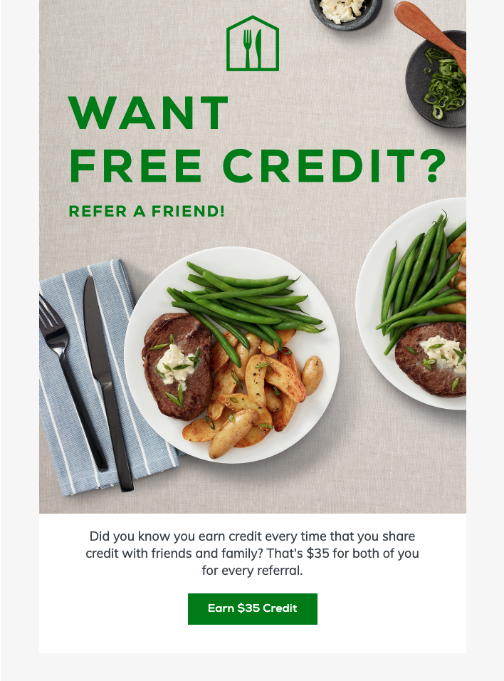
Home Chef sends a very short email promoting their referral program but they have a very convincing CTA “Earn $35 credit” that emphasizes the benefit for the referrers.
4. Create a landing page for the referred friends
You should decide where you want the referred friends to land after clicking on the link/code provided by the advocates. There are a couple of options. You can direct them to the general referral program page where you explain the rules of the program. You can also direct them to a referral program page specifically designed for the referred friends, explaining the rules from their perspective (focusing on how they can get their reward) and showing your products. You can also just direct them to your offer, by linking to your home page or your product pages.
The latter is the best option out of all because it will display your offer and bring referees one step closer to completing the purchase. However, if you choose that scenario, remember to add the referral program terms and conditions in the referral message you send to them. To make the reward redemption easier, it is best if the link to your offer is a deeplink that also adds the referral code to their basket so that they do not have to remember to copy it or to simply make your incentive an auto-applied promotion (if they follow that link). Make it clear then in the referral message that the offer will be applied only if they follow the link in that message and complete the order in the same session.
Example: Pretty Little Thing offers a separate landing page for the referred friends where they land after clicking on the link in the email. As the referral reward is an entry in the giveaway, the referred friend has to claim it by filling out a form.

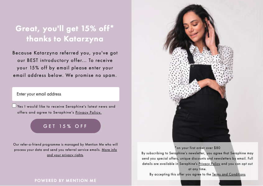
Seraphine offers a separate landing page for the referred friends who came through the referral link. They ask for the referred friend’s email address, then they display the discount code and a couple of links that will get them to the products catalog.
{{EBOOK}}
{{ENDEBOOK}}
5. Design progress notifications for the referrers
Just like any marketing campaign, it’s important to keep customers engaged and excited throughout the whole campaign. You should keep your advocates informed on the progress of their referrals. You can do so by sending them notifications every time something happens in the referral process. For example, if the referred friend made a purchase using the referral code or link. You should also inform the advocates once they receive incentives, let them know how to redeem them and how long they are valid.
Example: Haverdash sent an email campaign when they introduced a time-limited giveaway entry for the referrers and referees.
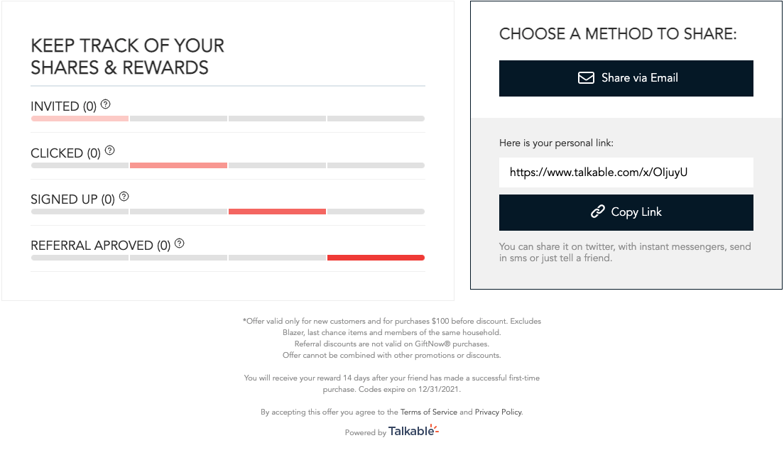
Let the referrers track their progress
If you allow for multiple referrals and offer rewards for each referral, it would be very useful for the referrers to see their progress. For example, when did they send a referral link, to whom, was it redeemed etc. You can also allow them to send a reminder to their friends who have not redeemed the reward yet. This way, you let them manage their referrals and avoid confusion on the status of their referrals. They will know exactly whom did they recommend and whom not yet.
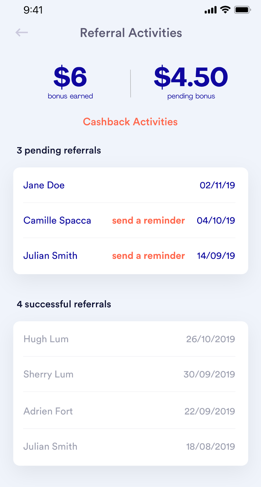
Examples: Eatsy offers a page in their mobile app that displays the status of all referrals made by a customer and lets them send reminders to the friends who have not used the offer yet. It also shows the amount of incentives that are available to the advocate.
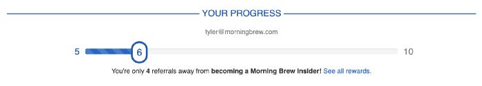
Morning Brew displays which rewards are possible to get for referring more friends and how far you are on your journey to getting to the next level:
Lulus provides a simple button with statistics of the referrals on their referral page (no need to be logged in, they pull the statistics once you provide your email address).

Mizzen+Main offers tracking of the referrals’ progress once you try to refer another friend and insert your email address on the referral page (similarly to Lulus but without having to press any buttons and it is on-page, not a pop-up, it also gives more information than Lulus).

6. Make the rewards easy to find
It is best to offer a place where the referrers can find their rewards. One option is to offer a dedicated referral tracking page, as mentioned above. Another is to offer a customer cockpit, where customers can track all their incentives, also the ones not related to referrals. It is especially important if the rewards have a longer expiration date or if you allow multiple referrals and the referrers may get multiple rewards.
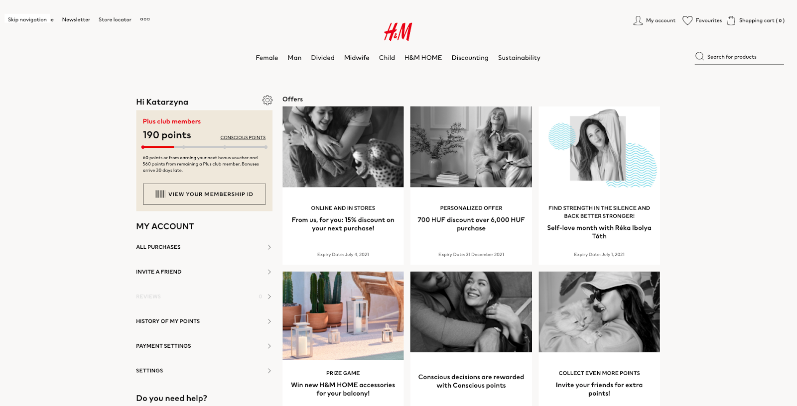
Example: H&M offers a customer cockpit, where customers can find their loyalty points balance, available discounts, unique vouchers, and a referral program.
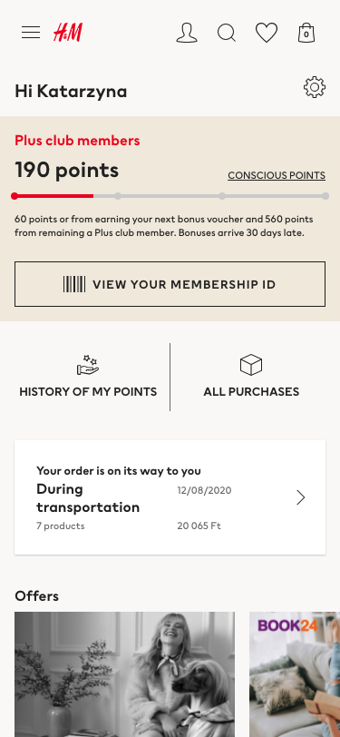
Here is their customer cockpit in the mobile app:
Design the checkout view for referral codes
If you offer a coupon code or gift card as a referral reward, you can refer to our Coupon Promotions UI best practices guide when it comes to the UX and UI for the basket and checkout views. We have covered the coupon box design and placement, error and success messages for both mobile and website views. If you only use referral codes, name it “referral code” and if both, you can name it coupon/referral code or a discount code.
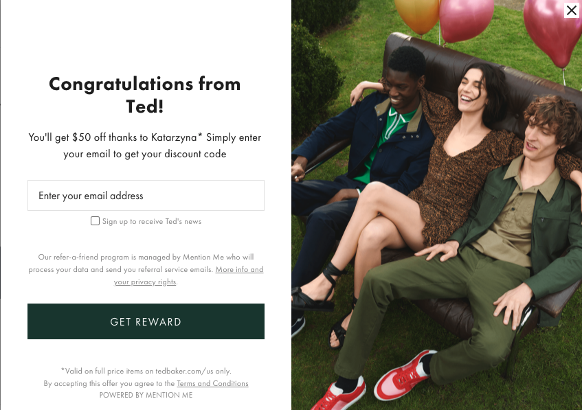
Example: Ted Baker offers a separate box for promotional code and for the referral code.
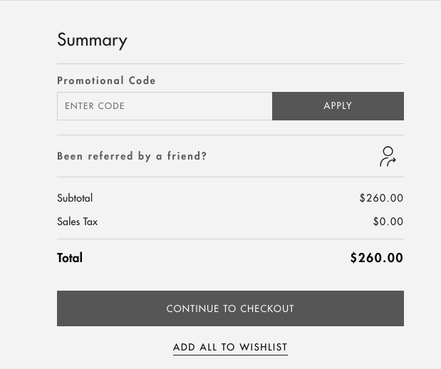
This is what appears if you click on “Been referred by a friend?” button:
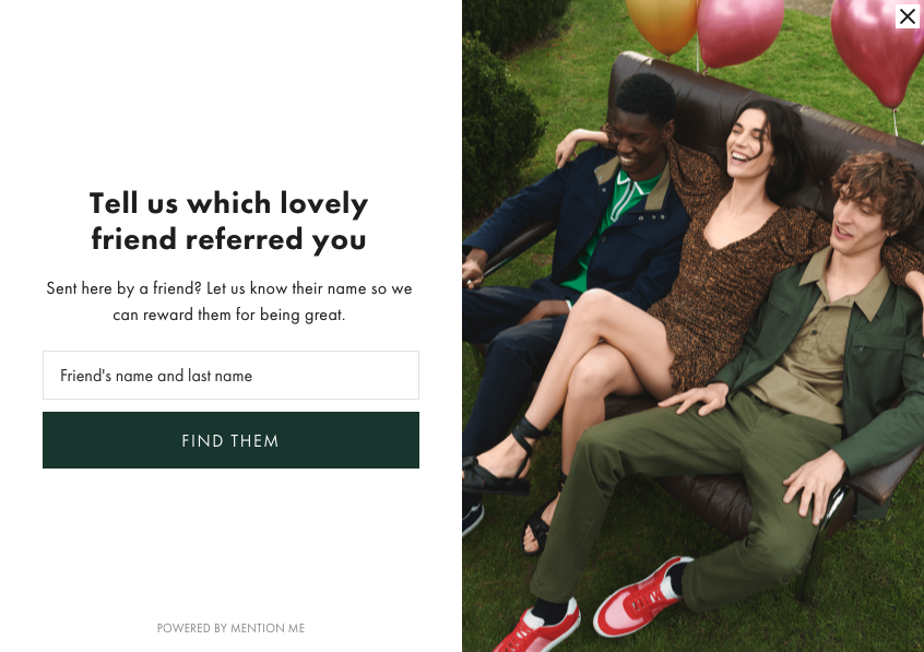
After entering the referrer’s name, the form asks you to provide your email address to get the discount code.
If you offer a cart discount, you should add it to the basket automatically and make sure it is mentioned in the messages that the discount will be added only if certain conditions are met, for example only if a customer logs in with the referred email or if they complete their order following the link they got from their friend.
If you offer another type of reward, make sure you explain to the customers how to claim it both in the terms and conditions or FAQ of the referral program and in the reward notifications.
Summary
I hope this list of UX best practices will help you to get started with designing your website and mobile for referral programs or improving your current design. We have also created a guide on creating effective referral programs that can help you with designing the referral program itself.
{{CTA}}
Ready to bring your referral programs to the next level?
{{ENDCTA}}


.jpeg)

.jpeg)
